Class 7: More pandas, Visualizations, xarray and Modeling
Working with String DataFrames
Pandas’ Series instances with a dtype of object or string expose a str attribute that enables vectorized string operations. These can come in tremendously handy, particularly when cleaning the data and performing aggregations on manually submitted fields.
Let’s imagine having the misfortune of reading some CSV data and finding the following headers:
import pandas as pd
import numpy as np
import matplotlib.pyplot as plt

messy_strings = [
    'Id___name', 'AGE', ' DomHand ', np.nan, 'qid    score1', 'score2', 3,
    ' COLOR_ SHAPe   _size', 'origin_residence immigration'
]
s = pd.Series(messy_strings, dtype="string", name="Messy Strings")
s
0                       Id___name
1                             AGE
2                        DomHand
3                            <NA>
4                   qid    score1
5                          score2
6                               3
7            COLOR_ SHAPe   _size
8    origin_residence immigration
Name: Messy Strings, dtype: string
To try and parse something more reasonable, we might first want to remove all unnecessary whitespace and underscores. One way to achieve that would be:
s_1 = s.str.strip().str.replace("[_\s]+", " ", regex=True).str.lower()
s_1
0                         id name
1                             age
2                         domhand
3                            <NA>
4                      qid score1
5                          score2
6                               3
7                color shape size
8    origin residence immigration
Name: Messy Strings, dtype: string
Let’s break this down:
strip()removed all whitespace from the beginning and end of the string.We used a regular expression to replace all one or more (
+) occurrences of whitespace (\s) and underscores with single spaces.We converted all characters to lowercase.
Next, we’ll split() strings separated by whitespace and extract an array of the values:
s_2 = s_1.str.split(expand=True)
print(f"DataFrame:\n{s_2}")

s_3 = s_2.to_numpy().flatten()
print(f"\nArray:\n{s_3}")
DataFrame:
         0          1            2
0       id       name         <NA>
1      age       <NA>         <NA>
2  domhand       <NA>         <NA>
3     <NA>       <NA>         <NA>
4      qid     score1         <NA>
5   score2       <NA>         <NA>
6        3       <NA>         <NA>
7    color      shape         size
8   origin  residence  immigration

Array:
['id' 'name' <NA> 'age' <NA> <NA> 'domhand' <NA> <NA> <NA> <NA> <NA> 'qid'
 'score1' <NA> 'score2' <NA> <NA> '3' <NA> <NA> 'color' 'shape' 'size'
 'origin' 'residence' 'immigration']
Finally, we can get rid of the <NA> values:
column_names = s_3[~pd.isnull(s_3)]
column_names
array(['id', 'name', 'age', 'domhand', 'qid', 'score1', 'score2', '3',
       'color', 'shape', 'size', 'origin', 'residence', 'immigration'],
      dtype=object)
DataFrame String Operations Exercise
Generate a 1000-length
pd.DataFramefilled with 3-letter strings. Use thestringmodule, and others, to generate it quickly.
Solution
import string
import numpy as np
import pandas as pd

# Generate the array
letters = list(string.ascii_lowercase)
size = 1000
num_of_letters = 3
chosen = np.random.choice(letters, size*num_of_letters)
chosen = chosen.reshape((size, num_of_letters))
df = pd.DataFrame(chosen, columns=['a', 'b', 'c'])
df['letters'] = df.a.str.cat(df.b.str.cat(df.c))
Add a column indicating if the string in this row has a
zin its 2nd character.
Solution
char = 'z'
df['no_z'] = df['letters'].str.find(char) != 1
Add a third column swapping the case of the 3-letter string in these specific lines (
azItoAZi). In the other lines it should remain uncapitalized.
Solution
df['swap'] = df['letters'].where(df['no_z'], other=df['letters'].str.upper())
Concatenation and Merging
Similarly to NumPy arrays, Series and DataFrame objects can be concatenated as well. However, having indices can often make this operation somewhat less trivial.
ser1 = pd.Series(['a', 'b', 'c'], index=[1, 2, 3])
ser2 = pd.Series(['d', 'e', 'f'], index=[4, 5, 6])
pd.concat([ser1, ser2])  # row-wise (axis=0) by default
1    a
2    b
3    c
4    d
5    e
6    f
dtype: object
We could also use the series’ append() method:
ser1.append(ser2)
1    a
2    b
3    c
4    d
5    e
6    f
dtype: object
Let’s do the same with dataframes:
df1 = pd.DataFrame([['a', 'A'], ['b', 'B']], columns=['let', 'LET'], index=[0, 1])
df2 = pd.DataFrame([['c', 'C'], ['d', 'D']], columns=['let', 'LET'], index=[2, 3])
pd.concat([df1, df2])  # again, along the first axis
| let | LET | |
|---|---|---|
| 0 | a | A |
| 1 | b | B |
| 2 | c | C |
| 3 | d | D |
This time, let’s complicate things a bit, and introduce different column names:
df1 = pd.DataFrame([['a', 'A'], ['b', 'B']], columns=['let1', 'LET1'], index=[0, 1])
df2 = pd.DataFrame([['c', 'C'], ['d', 'D']], columns=['let2', 'LET2'], index=[2, 3])
pd.concat([df1, df2])  # pandas can't make the column index compatible, so it resorts to columnar concat
| let1 | LET1 | let2 | LET2 | |
|---|---|---|---|---|
| 0 | a | A | NaN | NaN |
| 1 | b | B | NaN | NaN |
| 2 | NaN | NaN | c | C |
| 3 | NaN | NaN | d | D |
The same result would be achieved by:
pd.concat([df1, df2], axis=1)
| let1 | LET1 | let2 | LET2 | |
|---|---|---|---|---|
| 0 | a | A | NaN | NaN |
| 1 | b | B | NaN | NaN |
| 2 | NaN | NaN | c | C |
| 3 | NaN | NaN | d | D |
But what happens if introduce overlapping indices?
df1 = pd.DataFrame([['a', 'A'], ['b', 'B']], columns=['let', 'LET'], index=[0, 1])
df2 = pd.DataFrame([['c', 'C'], ['d', 'D']], columns=['let', 'LET'], index=[0, 2])
pd.concat([df1, df2])
| let | LET | |
|---|---|---|
| 0 | a | A |
| 1 | b | B |
| 0 | c | C |
| 2 | d | D |
Nothing, really! While not recommended in practice, pandas won’t judge you.
If, however, we wish to keep the integrity of the indices, we can use the verify_integrity keyword:
df1 = pd.DataFrame([['a', 'A'], ['b', 'B']], columns=['let', 'LET'], index=[0, 1])
df2 = pd.DataFrame([['c', 'C'], ['d', 'D']], columns=['let', 'LET'], index=[0, 2])
pd.concat([df1, df2], verify_integrity=True)
---------------------------------------------------------------------------
ValueError                                Traceback (most recent call last)
<ipython-input-11-6e1ecfdd699c> in <module>
      1 df1 = pd.DataFrame([['a', 'A'], ['b', 'B']], columns=['let', 'LET'], index=[0, 1])
      2 df2 = pd.DataFrame([['c', 'C'], ['d', 'D']], columns=['let', 'LET'], index=[0, 2])
----> 3 pd.concat([df1, df2], verify_integrity=True)

/opt/hostedtoolcache/Python/3.8.9/x64/lib/python3.8/site-packages/pandas/core/reshape/concat.py in concat(objs, axis, join, ignore_index, keys, levels, names, verify_integrity, sort, copy)
    283     ValueError: Indexes have overlapping values: ['a']
    284     """
--> 285     op = _Concatenator(
    286         objs,
    287         axis=axis,

/opt/hostedtoolcache/Python/3.8.9/x64/lib/python3.8/site-packages/pandas/core/reshape/concat.py in __init__(self, objs, axis, join, keys, levels, names, ignore_index, verify_integrity, copy, sort)
    465         self.copy = copy
    466
--> 467         self.new_axes = self._get_new_axes()
    468
    469     def get_result(self):

/opt/hostedtoolcache/Python/3.8.9/x64/lib/python3.8/site-packages/pandas/core/reshape/concat.py in _get_new_axes(self)
    535     def _get_new_axes(self) -> List[Index]:
    536         ndim = self._get_result_dim()
--> 537         return [
    538             self._get_concat_axis() if i == self.bm_axis else self._get_comb_axis(i)
    539             for i in range(ndim)

/opt/hostedtoolcache/Python/3.8.9/x64/lib/python3.8/site-packages/pandas/core/reshape/concat.py in <listcomp>(.0)
    536         ndim = self._get_result_dim()
    537         return [
--> 538             self._get_concat_axis() if i == self.bm_axis else self._get_comb_axis(i)
    539             for i in range(ndim)
    540         ]

/opt/hostedtoolcache/Python/3.8.9/x64/lib/python3.8/site-packages/pandas/core/reshape/concat.py in _get_concat_axis(self)
    596             )
    597
--> 598         self._maybe_check_integrity(concat_axis)
    599
    600         return concat_axis

/opt/hostedtoolcache/Python/3.8.9/x64/lib/python3.8/site-packages/pandas/core/reshape/concat.py in _maybe_check_integrity(self, concat_index)
    604             if not concat_index.is_unique:
    605                 overlap = concat_index[concat_index.duplicated()].unique()
--> 606                 raise ValueError(f"Indexes have overlapping values: {overlap}")
    607
    608

ValueError: Indexes have overlapping values: Int64Index([0], dtype='int64')
If we don’t care about the indices, we can just ignore them:
pd.concat([df1, df2], ignore_index=True) # resets the index
| let | LET | |
|---|---|---|
| 0 | a | A |
| 1 | b | B |
| 2 | c | C |
| 3 | d | D |
We can also create a new MultiIndex if that happens to makes more sense:
pd.concat([df1, df2], keys=['df1', 'df2']) # "remembers" the origin of the data, super useful!
| let | LET | ||
|---|---|---|---|
| df1 | 0 | a | A |
| 1 | b | B | |
| df2 | 0 | c | C |
| 2 | d | D |
A common real world example of concatenation happens when joining two datasets sampled at different times. For example, if we conducted in day 1 measurements at times 8:00, 10:00, 14:00 and 16:00, but during day 2 we were a bit dizzy, and conducted the measurements at 8:00, 10:00, 13:00 and 16:30. On top of that, we recorded another parameter that we forget to measure at day 1.
The default concatenation behavior of pandas keeps all the data. In database terms (SQL people rejoice!) it’s called an “outer join”:
# Prepare mock data
day_1_times = pd.to_datetime(['08:00', '10:00', '14:00', '16:00'],
                             format='%H:%M').time
day_2_times = pd.to_datetime(['08:00', '10:00', '13:00', '16:30'],
                             format='%H:%M').time

day_1_data = {
    "temperature": [36.6, 36.7, 37.0, 36.8],
    "humidity": [30., 31., 30.4, 30.4]
}
day_2_data = {
    "temperature": [35.9, 36.1, 36.5, 36.2],
    "humidity": [32.2, 34.2, 30.9, 32.6],
    "light": [200, 130, 240, 210]
}

df_1 = pd.DataFrame(day_1_data, index=day_1_times)
df_2 = pd.DataFrame(day_2_data, index=day_2_times)

df_1
| temperature | humidity | |
|---|---|---|
| 08:00:00 | 36.6 | 30.0 |
| 10:00:00 | 36.7 | 31.0 |
| 14:00:00 | 37.0 | 30.4 |
| 16:00:00 | 36.8 | 30.4 |
Note
Note how pd.to_datetime() returns a DatetimeIndex object which exposes a time property, allowing us to easily remove the “date” part of the returned “datetime”, considering it is not represented in our mock data.
df_2
| temperature | humidity | light | |
|---|---|---|---|
| 08:00:00 | 35.9 | 32.2 | 200 |
| 10:00:00 | 36.1 | 34.2 | 130 |
| 13:00:00 | 36.5 | 30.9 | 240 |
| 16:30:00 | 36.2 | 32.6 | 210 |
# Outer join
pd.concat([df_1, df_2], join='outer')  # outer join is the default behavior
| temperature | humidity | light | |
|---|---|---|---|
| 08:00:00 | 36.6 | 30.0 | NaN |
| 10:00:00 | 36.7 | 31.0 | NaN |
| 14:00:00 | 37.0 | 30.4 | NaN |
| 16:00:00 | 36.8 | 30.4 | NaN |
| 08:00:00 | 35.9 | 32.2 | 200.0 |
| 10:00:00 | 36.1 | 34.2 | 130.0 |
| 13:00:00 | 36.5 | 30.9 | 240.0 |
| 16:30:00 | 36.2 | 32.6 | 210.0 |
To take the intersection of the columns we have to use inner join. The intersection is all the columns that are common in all datasets.
# Inner join - the excess data column was dropped (index is still not unique)
pd.concat([df_1, df_2], join='inner')
| temperature | humidity | |
|---|---|---|
| 08:00:00 | 36.6 | 30.0 |
| 10:00:00 | 36.7 | 31.0 |
| 14:00:00 | 37.0 | 30.4 |
| 16:00:00 | 36.8 | 30.4 |
| 08:00:00 | 35.9 | 32.2 |
| 10:00:00 | 36.1 | 34.2 |
| 13:00:00 | 36.5 | 30.9 |
| 16:30:00 | 36.2 | 32.6 |
One can also specify the exact columns that should be the result of the join operation using the columns keyword. All in all, this basic functionality is easy to understand and allows for high flexibility.
Finally, joining on the columns will require the indices to be unique:
pd.concat([df_1, df_2], join='inner', axis='columns')
| temperature | humidity | temperature | humidity | light | |
|---|---|---|---|---|---|
| 08:00:00 | 36.6 | 30.0 | 35.9 | 32.2 | 200 |
| 10:00:00 | 36.7 | 31.0 | 36.1 | 34.2 | 130 |
This doesn’t look so good. The columns are a mess and we’re barely left with any data.
Our best option using pd.concat() might be something like:
df_concat = pd.concat([df_1, df_2], keys=["Day 1", "Day 2"])
df_concat
| temperature | humidity | light | ||
|---|---|---|---|---|
| Day 1 | 08:00:00 | 36.6 | 30.0 | NaN |
| 10:00:00 | 36.7 | 31.0 | NaN | |
| 14:00:00 | 37.0 | 30.4 | NaN | |
| 16:00:00 | 36.8 | 30.4 | NaN | |
| Day 2 | 08:00:00 | 35.9 | 32.2 | 200.0 |
| 10:00:00 | 36.1 | 34.2 | 130.0 | |
| 13:00:00 | 36.5 | 30.9 | 240.0 | |
| 16:30:00 | 36.2 | 32.6 | 210.0 |
Or maybe an unstacked version:
df_concat.unstack(0)
| temperature | humidity | light | ||||
|---|---|---|---|---|---|---|
| Day 1 | Day 2 | Day 1 | Day 2 | Day 1 | Day 2 | |
| 08:00:00 | 36.6 | 35.9 | 30.0 | 32.2 | NaN | 200.0 |
| 10:00:00 | 36.7 | 36.1 | 31.0 | 34.2 | NaN | 130.0 |
| 13:00:00 | NaN | 36.5 | NaN | 30.9 | NaN | 240.0 |
| 14:00:00 | 37.0 | NaN | 30.4 | NaN | NaN | NaN |
| 16:00:00 | 36.8 | NaN | 30.4 | NaN | NaN | NaN |
| 16:30:00 | NaN | 36.2 | NaN | 32.6 | NaN | 210.0 |
We could also use pd.merge():
pd.merge(df_1,
         df_2,
         how="outer",           # Keep all indices (rather than just the intersection)
         left_index=True,       # Use left index
         right_index=True,      # Use right index
         suffixes=("_1", "_2")) # Suffixes to use for overlapping columns
| temperature_1 | humidity_1 | temperature_2 | humidity_2 | light | |
|---|---|---|---|---|---|
| 08:00:00 | 36.6 | 30.0 | 35.9 | 32.2 | 200.0 |
| 10:00:00 | 36.7 | 31.0 | 36.1 | 34.2 | 130.0 |
| 13:00:00 | NaN | NaN | 36.5 | 30.9 | 240.0 |
| 14:00:00 | 37.0 | 30.4 | NaN | NaN | NaN |
| 16:00:00 | 36.8 | 30.4 | NaN | NaN | NaN |
| 16:30:00 | NaN | NaN | 36.2 | 32.6 | 210.0 |
The dataframe’s merge() method also enables easily combining columns from a different (but similarly indexed) dataframe:
mouse_id = [511, 512, 513, 514]
meas1 = [67, 66, 89, 92]
meas2 = [45, 45, 65, 61]

data_1 = {"ID": [500, 501, 502, 503], "Blood Volume": [100, 102, 99, 101]}
data_2 = {"ID": [500, 501, 502, 503], "Monocytes": [20, 19, 25, 21]}

df_1 = pd.DataFrame(data_1)
df_2 = pd.DataFrame(data_2)
df_1
| ID | Blood Volume | |
|---|---|---|
| 0 | 500 | 100 |
| 1 | 501 | 102 |
| 2 | 502 | 99 |
| 3 | 503 | 101 |
df_1.merge(df_2) # merge identified that the only "key" connecting the two tables was the 'id' key
| ID | Blood Volume | Monocytes | |
|---|---|---|---|
| 0 | 500 | 100 | 20 |
| 1 | 501 | 102 | 19 |
| 2 | 502 | 99 | 25 |
| 3 | 503 | 101 | 21 |
Database-like operations are a very broad topic with advanced implementations in pandas.
Concatenation and Merging Exercise
Create three dataframes with random values and shapes of (10, 2), (10, 1), (15, 3). Their index should be simple ordinal integers, and their column names should be different.
Solution
df_1 = pd.DataFrame(np.random.random((10, 2)), columns=['a', 'b'])
df_2 = pd.DataFrame(np.random.random((10, 1)), columns=['c'])
df_3 = pd.DataFrame(np.random.random((15, 3)), columns=['d', 'e', 'f'])
Concatenate these dataframes over the second axis using
pd.concat().
Solution
pd.concat([df_1, df_2, df_3], axis=1)
Concatenate these dataframes over the second axis using
pd.merge().
Solution
merge_kwargs = {"how": "outer", "left_index": True, "right_index": True}
pd.merge(pd.merge(df_1, df_2, **merge_kwargs), df_3, **merge_kwargs)
Grouping
Yet another SQL-like feature that pandas posses is the group-by operation, sometimes known as “split-apply-combine”.
# Mock data
subject = range(100, 200)
alive = np.random.choice([True, False], 100)
placebo = np.random.choice([True, False], 100)
measurement_1 = np.random.random(100)
measurement_2 = np.random.random(100)
data = {
    "Subject ID": subject,
    "Alive": alive,
    "Placebo": placebo,
    "Measurement 1": measurement_1,
    "Measurement 2": measurement_2
}
df = pd.DataFrame(data).set_index("Subject ID")
df
| Alive | Placebo | Measurement 1 | Measurement 2 | |
|---|---|---|---|---|
| Subject ID | ||||
| 100 | False | True | 0.656271 | 0.880203 |
| 101 | False | True | 0.236337 | 0.606731 |
| 102 | False | True | 0.224054 | 0.388316 |
| 103 | True | False | 0.035000 | 0.246676 |
| 104 | False | True | 0.318954 | 0.777598 |
| ... | ... | ... | ... | ... |
| 195 | True | True | 0.331835 | 0.827458 |
| 196 | True | False | 0.023397 | 0.281937 |
| 197 | False | True | 0.408280 | 0.053739 |
| 198 | True | True | 0.961052 | 0.535626 |
| 199 | False | False | 0.300725 | 0.143704 |
100 rows × 4 columns
The most sensible thing to do is to group by either the “Alive” or the “Placebo” columns (or both). This is the “split” part.
grouped = df.groupby('Alive')
grouped  # DataFrameGroupBy object - intermediate object ready to be evaluated
<pandas.core.groupby.generic.DataFrameGroupBy object at 0x7fa6441b6640>
This intermediate object is an internal pandas representation which should allow it to run very fast computation the moment we want to actually know something about these groups. Assuming we want the mean of val1, as long as we won’t specifically write grouped.mean() pandas will do very little in terms of actual computation. It’s called “lazy evaluation”.
The intermediate object has some useful attributes:
grouped.groups
{False: [100, 101, 102, 104, 106, 109, 111, 112, 114, 115, 117, 118, 120, 121, 129, 132, 138, 139, 140, 141, 144, 146, 149, 150, 151, 152, 155, 157, 158, 159, 161, 162, 164, 165, 166, 168, 169, 170, 173, 175, 176, 178, 179, 180, 181, 182, 183, 184, 185, 186, 190, 192, 194, 197, 199], True: [103, 105, 107, 108, 110, 113, 116, 119, 122, 123, 124, 125, 126, 127, 128, 130, 131, 133, 134, 135, 136, 137, 142, 143, 145, 147, 148, 153, 154, 156, 160, 163, 167, 171, 172, 174, 177, 187, 188, 189, 191, 193, 195, 196, 198]}
len(grouped) # True and False
2
If we wish to run some actual processing, we have to use an aggregation function:
grouped.sum()
| Placebo | Measurement 1 | Measurement 2 | |
|---|---|---|---|
| Alive | |||
| False | 34 | 30.813679 | 27.196426 |
| True | 24 | 18.834092 | 20.364101 |
grouped.mean()
| Placebo | Measurement 1 | Measurement 2 | |
|---|---|---|---|
| Alive | |||
| False | 0.618182 | 0.560249 | 0.494480 |
| True | 0.533333 | 0.418535 | 0.452536 |
grouped.size()
Alive
False    55
True     45
dtype: int64
If we just wish to see one of the groups, we can use get_group():
grouped.get_group(True).head()
| Alive | Placebo | Measurement 1 | Measurement 2 | |
|---|---|---|---|---|
| Subject ID | ||||
| 103 | True | False | 0.035000 | 0.246676 |
| 105 | True | False | 0.176295 | 0.776051 |
| 107 | True | True | 0.401615 | 0.071564 |
| 108 | True | False | 0.498695 | 0.252083 |
| 110 | True | False | 0.046116 | 0.104129 |
We can also call several functions at once using the .agg attribute:
grouped.agg([np.mean, np.std]).drop("Placebo", axis=1)
| Measurement 1 | Measurement 2 | |||
|---|---|---|---|---|
| mean | std | mean | std | |
| Alive | ||||
| False | 0.560249 | 0.279257 | 0.494480 | 0.272726 |
| True | 0.418535 | 0.310452 | 0.452536 | 0.273939 |
Grouping by multiple columns:
grouped2 = df.groupby(['Alive', 'Placebo'])
grouped2
<pandas.core.groupby.generic.DataFrameGroupBy object at 0x7fa61eae4400>
grouped2.agg([np.sum, np.var])
| Measurement 1 | Measurement 2 | ||||
|---|---|---|---|---|---|
| sum | var | sum | var | ||
| Alive | Placebo | ||||
| False | False | 12.453866 | 0.092148 | 11.091045 | 0.084432 |
| True | 18.359812 | 0.070657 | 16.105381 | 0.069374 | |
| True | False | 8.065560 | 0.102912 | 10.175483 | 0.075778 |
| True | 10.768532 | 0.092859 | 10.188618 | 0.075911 | |
groupby() offers many more features, available here.
Grouping Exercise
Create a dataframe with two columns, 10,000 entries in length. The first should be a random boolean column, and the second should be A sine wave from 0 to 20\(\pi\). This simulates measuring a parameter from two distinct groups.
Solution
boolean_groups = np.array([False, True])
n_subjects = 100
stop = 20 * np.pi
group_choice = np.random.choice(boolean_groups, n_subjects)
values = np.sin(np.linspace(start=0, stop=stop, num=n_subjects))
df = pd.DataFrame({'group': group_choice, 'value': values})
Group by the DataFrame, creating a
GroupByobject.
Solution
grouped = df.groupby("group")
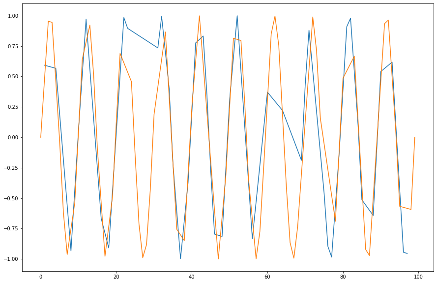
Plot the values of the grouped dataframe.
Solution
import matplotlib.pyplot as plt

fig, ax = plt.subplots(figsize=(15, 10))
grouped_plot = grouped.value.plot(ax=ax)
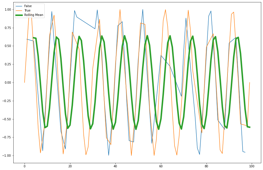
Use the
rolling()method to create a rolling average window of length 5 and overlay the result.
Solution
window_size = 5
rolling_mean = df.value.rolling(window=window_size).mean()
rolling_mean.plot(ax=ax, label="Rolling Mean", linewidth=5)
ax.legend(loc="upper left")
Other Pandas Features
Pandas has a TON of features and small implementation details that are there to make your life simpler. Features like IntervalIndex to index the data between two numbers instead of having a single label, for example, are very nice and ergonomic if you need them. Sparse DataFrames are also included, as well as many other computational tools, serialization capabilities, and more. If you need it - there’s a good chance it already exists as a method in the pandas jungle.
Data Visualization
As mentioned previously the visualization landscape in Python is rich, and is becoming richer by the day. Below, we’ll explore some of the options we have.
* We’ll assume that 2D data is accessed from a dataframe.
matplotlib
The built-in df.plot() method is a simple wrapper around pyplot from matplotlib, and as we’ve seen before it works quite well for many types of plots, as long as we wish to keep them all overlayed in some sort. Let’s look at examples taken straight from the visualization manual of pandas:
ts = pd.Series(np.random.randn(1000),
               index=pd.date_range('1/1/2000', periods=1000))
df = pd.DataFrame(np.random.randn(1000, 4),
                  index=ts.index,
                  columns=list('ABCD'))
df = df.cumsum()
df
| A | B | C | D | |
|---|---|---|---|---|
| 2000-01-01 | 0.436808 | -0.233281 | 1.681464 | 0.944159 |
| 2000-01-02 | -0.308731 | -1.398772 | 1.849213 | 0.448974 |
| 2000-01-03 | 0.611240 | -1.504729 | 0.224078 | 1.888257 |
| 2000-01-04 | 0.007353 | -2.778013 | -0.289646 | 1.624527 |
| 2000-01-05 | -1.899029 | -3.668728 | -0.327653 | 2.560626 |
| ... | ... | ... | ... | ... |
| 2002-09-22 | 46.440656 | -74.501127 | 20.096539 | 44.009355 |
| 2002-09-23 | 48.348969 | -75.579892 | 20.077513 | 44.276985 |
| 2002-09-24 | 48.755978 | -75.945835 | 20.117760 | 45.020706 |
| 2002-09-25 | 49.834250 | -76.298966 | 20.017068 | 46.050789 |
| 2002-09-26 | 52.877734 | -74.606611 | 19.204946 | 48.278607 |
1000 rows × 4 columns
_ = df.plot()
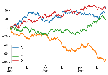
Nice to see we got a few things for “free”, like sane x-axis labels and the legend.
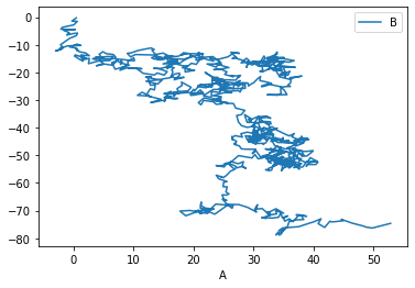
We can tell pandas which column corresponds to x, and which to y:
_ = df.plot(x='A', y='B')
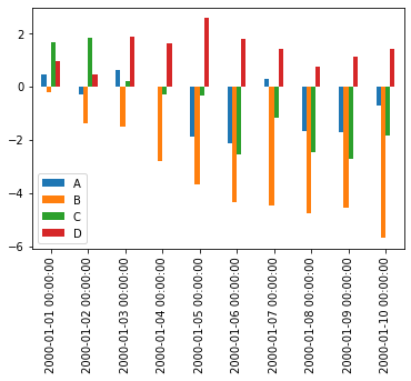
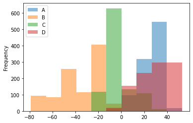
There are, of course, many possible types of plots that can be directly called from the pandas interface:
_ = df.iloc[:10, :].plot.bar()
_ = df.plot.hist(alpha=0.5)
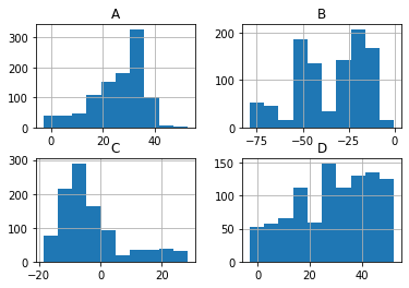
Histogramming each column separately can be done by calling the hist() method directly:
_ = df.hist()
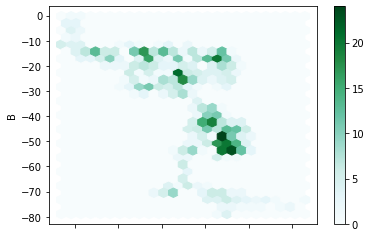
Lastly, a personal favorite:
_ = df.plot.hexbin(x='A', y='B', gridsize=25)
Altair
Matplotlib (and pandas’ interface to it) is the gold standard in the Python ecosystem - but there are other ecosystems as well. For example, vega-lite is a famous plotting library for the web and Javascript, and it uses a different grammar to define its plots. If you’re familiar with it you’ll be delighted to hear that Python’s altair provides bindings to it, and even if you’ve never heard of it it’s always nice to see that there are many other different ways to tell a computer how to draw stuff on the screen. Let’s look at a couple of examples:
import altair as alt

chart = alt.Chart(df)
chart.mark_point().encode(x='A', y='B')
In Altair you first create a chart object (a simple Chart above), and then you ask it to mark_point(), or mark_line(), to add that type of visualization to the chart. Then we specify the axis and other types of parameters (like color) and map (or encode) them to their corresponding column.
Let’s see how Altair works with other datatypes:
datetime_df = pd.DataFrame({'value': np.random.randn(100).cumsum()},
                           index=pd.date_range('2020', freq='D', periods=100))

datetime_df.head()
| value | |
|---|---|
| 2020-01-01 | 1.805058 |
| 2020-01-02 | 3.634533 |
| 2020-01-03 | 4.837092 |
| 2020-01-04 | 5.098164 |
| 2020-01-05 | 4.193047 |
chart = alt.Chart(datetime_df.reset_index())
chart.mark_line().encode(x='index:T', y='value:Q')
Above we plot the datetime data by telling Altair that the column named “index” is of type T, i.e. Time, while the column “value” is of type Q for quantitative.
One of the great things about these charts is that they can easily be made to be interactive:
from vega_datasets import data # ready-made DFs for easy visualization examples
cars = data.cars
cars()
| Name | Miles_per_Gallon | Cylinders | Displacement | Horsepower | Weight_in_lbs | Acceleration | Year | Origin | |
|---|---|---|---|---|---|---|---|---|---|
| 0 | chevrolet chevelle malibu | 18.0 | 8 | 307.0 | 130.0 | 3504 | 12.0 | 1970-01-01 | USA |
| 1 | buick skylark 320 | 15.0 | 8 | 350.0 | 165.0 | 3693 | 11.5 | 1970-01-01 | USA |
| 2 | plymouth satellite | 18.0 | 8 | 318.0 | 150.0 | 3436 | 11.0 | 1970-01-01 | USA |
| 3 | amc rebel sst | 16.0 | 8 | 304.0 | 150.0 | 3433 | 12.0 | 1970-01-01 | USA |
| 4 | ford torino | 17.0 | 8 | 302.0 | 140.0 | 3449 | 10.5 | 1970-01-01 | USA |
| ... | ... | ... | ... | ... | ... | ... | ... | ... | ... |
| 401 | ford mustang gl | 27.0 | 4 | 140.0 | 86.0 | 2790 | 15.6 | 1982-01-01 | USA |
| 402 | vw pickup | 44.0 | 4 | 97.0 | 52.0 | 2130 | 24.6 | 1982-01-01 | Europe |
| 403 | dodge rampage | 32.0 | 4 | 135.0 | 84.0 | 2295 | 11.6 | 1982-01-01 | USA |
| 404 | ford ranger | 28.0 | 4 | 120.0 | 79.0 | 2625 | 18.6 | 1982-01-01 | USA |
| 405 | chevy s-10 | 31.0 | 4 | 119.0 | 82.0 | 2720 | 19.4 | 1982-01-01 | USA |
406 rows × 9 columns
cars_url = data.cars.url
cars_url  # The data is online and in json format which is standard practice for altair-based workflows
'https://cdn.jsdelivr.net/npm/vega-datasets@v1.29.0/data/cars.json'
alt.Chart(cars_url).mark_point().encode(
    x='Miles_per_Gallon:Q',
    y='Horsepower:Q',
    color='Origin:N',  # N for nominal, i.e. discrete and unordered (just like colors)
)
brush = alt.selection_interval() # selection of type 'interval'
alt.Chart(cars_url).mark_point().encode(
    x='Miles_per_Gallon:Q',
    y='Horsepower:Q',
    color='Origin:N',  # N for nominal, i.e.discrete and unordered (just like colors)
).add_selection(brush)
The selection looks good but doesn’t do anything. Let’s add functionality:
alt.Chart(cars_url).mark_point().encode(
    x='Miles_per_Gallon:Q',
    y='Horsepower:Q',
    color=alt.condition(brush, 'Origin:N', alt.value('lightgray'))
).add_selection(
    brush
)
Altair has a ton more visualization types, some of which are more easily generated than others, and some are easier to generate using Altair rather than Matplotlib.
Bokeh, Holoviews and pandas-bokeh
Bokeh is another visualization effort in the Python ecosystem, but this time it revolves around web-based plots. Bokeh can be used directly, but it also serves as a backend plotting device for more advanced plotting libraries, like Holoviews and pandas-bokeh. It’s also designed in mind with huge datasets that don’t fit in memory, which is something that other tools might have trouble visualizing.
import bokeh
from bokeh.io import output_notebook, show
from bokeh.plotting import figure as bkfig
output_notebook()
bokeh_figure = bkfig(plot_width=400, plot_height=400)
x = [1, 2, 3, 4, 5]
y = [6, 7, 2, 4, 5]
bokeh_figure.circle(x,
                    y,
                    size=15,
                    line_color="navy",
                    fill_color="orange",
                    fill_alpha=0.5)

show(bokeh_figure)
We see how bokeh immediately outputs an interactive graph, i.e. an HTML document that will open in your browser (a couple of cells above we kindly asked bokeh to output its plots to the notebook instead). Bokeh can be used for many other types of plots, like:
datetime_df = datetime_df.reset_index()
datetime_df
| index | value | |
|---|---|---|
| 0 | 2020-01-01 | 1.805058 |
| 1 | 2020-01-02 | 3.634533 |
| 2 | 2020-01-03 | 4.837092 |
| 3 | 2020-01-04 | 5.098164 |
| 4 | 2020-01-05 | 4.193047 |
| ... | ... | ... |
| 95 | 2020-04-05 | 16.772817 |
| 96 | 2020-04-06 | 18.407678 |
| 97 | 2020-04-07 | 17.487491 |
| 98 | 2020-04-08 | 16.240463 |
| 99 | 2020-04-09 | 16.276244 |
100 rows × 2 columns
bokeh_figure_2 = bkfig(x_axis_type="datetime",
                       title="Value over Time",
                       plot_height=350,
                       plot_width=800)

bokeh_figure_2.xgrid.grid_line_color = None
bokeh_figure_2.ygrid.grid_line_alpha = 0.5
bokeh_figure_2.xaxis.axis_label = 'Time'
bokeh_figure_2.yaxis.axis_label = 'Value'

bokeh_figure_2.line(datetime_df.index, datetime_df.value)
show(bokeh_figure_2)
This is cool but not yet exciting. Adding a layer on top of bokeh is what makes it special. Let’s look at Pandas-Bokeh first, which adds a plot_bokeh() method to dataframes once you import it:
import pandas_bokeh

_ = df.plot_bokeh()
This small library has many other types of plots, all based around Bokeh’s feature set. Let’s look at energy consumption, split by source (from the Pandas-Bokeh manual):
url = "https://raw.githubusercontent.com/PatrikHlobil/Pandas-Bokeh/master/docs/Testdata/energy/energy.csv"
df_energy = pd.read_csv(url, parse_dates=["Year"])
df_energy.head()
| Year | Oil | Gas | Coal | Nuclear Energy | Hydroelectricity | Other Renewable | |
|---|---|---|---|---|---|---|---|
| 0 | 1970-01-01 | 2291.5 | 826.7 | 1467.3 | 17.7 | 265.8 | 5.8 |
| 1 | 1971-01-01 | 2427.7 | 884.8 | 1459.2 | 24.9 | 276.4 | 6.3 |
| 2 | 1972-01-01 | 2613.9 | 933.7 | 1475.7 | 34.1 | 288.9 | 6.8 |
| 3 | 1973-01-01 | 2818.1 | 978.0 | 1519.6 | 45.9 | 292.5 | 7.3 |
| 4 | 1974-01-01 | 2777.3 | 1001.9 | 1520.9 | 59.6 | 321.1 | 7.7 |
colors = ["brown", "orange", "black", "grey", "blue", "green"]

df_energy.plot_bokeh.area(
    x="Year",
    stacked=True,
    colormap=colors,
    title="Worldwide Energy Consumption Split by Source",
    ylabel="Million Tonnes Oil Equivalent",
    ylim=(0, 16000)
)
Another Bokeh-based library is Holoviews. Its uniqueness stems from the way it handles DataFrames with multiple columns, and the way you add plots to each other. It’s very suitable for Jupyter notebook based plots:
import holoviews as hv

hv.extension('bokeh')
df_energy.head()
| Year | Oil | Gas | Coal | Nuclear Energy | Hydroelectricity | Other Renewable | |
|---|---|---|---|---|---|---|---|
| 0 | 1970-01-01 | 2291.5 | 826.7 | 1467.3 | 17.7 | 265.8 | 5.8 |
| 1 | 1971-01-01 | 2427.7 | 884.8 | 1459.2 | 24.9 | 276.4 | 6.3 |
| 2 | 1972-01-01 | 2613.9 | 933.7 | 1475.7 | 34.1 | 288.9 | 6.8 |
| 3 | 1973-01-01 | 2818.1 | 978.0 | 1519.6 | 45.9 | 292.5 | 7.3 |
| 4 | 1974-01-01 | 2777.3 | 1001.9 | 1520.9 | 59.6 | 321.1 | 7.7 |
scatter = hv.Scatter(df_energy, 'Oil', 'Gas')
scatter
scatter + hv.Curve(df_energy, 'Oil', 'Hydroelectricity')
def get_year_coal(df, year) -> int:
    return df.loc[df["Year"] == year, "Coal"]

items = {year: hv.Bars(get_year_coal(df_energy, year)) for year in df_energy["Year"]}

hv.HoloMap(items, kdims=['Year'])
Holoviews really needs an entire class (or two) to go over its concepts, but once you get them you can create complicated visualizations which include a strong interactive component in a few lines of code.
Seaborn
A library which has really become a shining example of quick, efficient and clear plotting in the post-pandas era is seaborn. It combines many of the features of the previous libraries into a very concise API. Unlike a few of the previous libraries, however, it doesn’t use bokeh as its backend, but matplotlib, which means that the interactivity of the resulting plots isn’t as good. Be that as it may, it’s still a widely used library, and for good reasons.
In order to use seaborn to its full extent (and really all of the above libraries) we have to take a short detour and understand how to transform our data into a long-form format.
Long form (“tidy”) data
Tidy data was first defined the R language (its “tidyverse” subset) as the preferred format for analysis and visualization. If you assume that the data you’re about to visualize is always in such a format, you can design plotting libraries that use these assumptions to cut the number of lines of code you have to write in order to see the final art. Tidy data migrated to the Pythonic data science ecosystem, and nowadays it’s the preferred data format in the pandas ecosystem as well. The way to construct a “tidy” table is to follow three simple rules:
Each variable forms a column.
Each observation forms a row.
Each type of observational unit forms a table.
In the paper defining tidy data, the following example is given - Assume we have the following data table:
name |
treatment a |
treatment b |
|---|---|---|
John Smith |
- |
20.1 |
Jane Doe |
15.1 |
13.2 |
Mary Johnson |
22.8 |
27.5 |
Is this the “tidy” form? What are the variables and observations here? Well, we could’ve written this table in a different (‘transposed’) format:
treatment type |
John Smith |
Jane Doe |
Mary Johnson |
|---|---|---|---|
treat. a |
- |
15.1 |
22.8 |
treat. b |
20.1 |
13.2 |
27.5 |
Is this “long form”?
In both cases, the answer is no. We have to move each observation into its own row, and in the above two tables two (or more) observations were placed in the same row. For example, Both observations concerning Mary Johnson (the measured value of treatment a and b) were located in the same row, which violates rule #2 of the “tidy” data rules. This is how the tidy version of the above tables look like:
name |
treatment |
measurement |
|---|---|---|
John Doe |
a |
- |
Jane Doe |
a |
15.1 |
Mary Johnson |
a |
22.8 |
John Doe |
b |
20.1 |
Jane Doe |
b |
13.2 |
Mary Johnson |
b |
27.5 |
Now each measurement has a single row, and the treatment column became an “index” of some sort. The only shortcoming of this approach is the fact that we now have more cells in the table. We had 9 in the previous two versions, but this one has 18. This is quite a jump, but if we’re smart about our data types (categorical data types) then the jump in memory usage wouldn’t become too hard.
As I wrote in the previous class, pandas has methods to transform data into its long form. You’ll usually need to use df.stack() or df.melt() to make it tidy. Let’s try to make our own data tidy:
df = pd.read_csv("pew_raw.csv")
df
| religion | 10000 | 20000 | 30000 | 40000 | 50000 | 75000 | |
|---|---|---|---|---|---|---|---|
| 0 | Agnostic | 27 | 34 | 60 | 81 | 76 | 137 |
| 1 | Atheist | 12 | 27 | 37 | 52 | 35 | 70 |
| 2 | Buddhist | 27 | 21 | 30 | 34 | 33 | 58 |
| 3 | Catholic | 418 | 617 | 732 | 670 | 638 | 1116 |
| 4 | Dont know/refused | 15 | 14 | 15 | 11 | 10 | 35 |
| 5 | Evangelical Prot | 575 | 869 | 1064 | 982 | 881 | 1486 |
| 6 | Hindu | 1 | 9 | 7 | 9 | 11 | 34 |
| 7 | Historically Black Prot | 228 | 244 | 236 | 238 | 197 | 223 |
| 8 | Jehovahs Witness | 20 | 27 | 24 | 24 | 21 | 30 |
| 9 | Jewish | 19 | 19 | 25 | 25 | 30 | 95 |
This is a table from the Pew Research Center on the relations between income (in USD) and religion. This dataset is not in a tidy format since the column headers contain information about specific observations (measurements). For example, the 27 agnostic individuals who donated less than $10k represent a measurement, and the 34 that donated $10k-20k represent another one, and so on.
To make it tidy we’ll use melt():
tidy_df = (pd.melt(df,
                  ["religion"],
                  var_name="income",
                  value_name="freq")
           .sort_values(by=["religion"])
           .reset_index(drop=True)
           .astype({'income': 'category', 'religion': 'category'}))
tidy_df
| religion | income | freq | |
|---|---|---|---|
| 0 | Agnostic | 10000 | 27 |
| 1 | Agnostic | 40000 | 81 |
| 2 | Agnostic | 50000 | 76 |
| 3 | Agnostic | 75000 | 137 |
| 4 | Agnostic | 20000 | 34 |
| 5 | Agnostic | 30000 | 60 |
| 6 | Atheist | 50000 | 35 |
| 7 | Atheist | 30000 | 37 |
| 8 | Atheist | 20000 | 27 |
| 9 | Atheist | 40000 | 52 |
| 10 | Atheist | 10000 | 12 |
| 11 | Atheist | 75000 | 70 |
| 12 | Buddhist | 50000 | 33 |
| 13 | Buddhist | 10000 | 27 |
| 14 | Buddhist | 20000 | 21 |
| 15 | Buddhist | 40000 | 34 |
| 16 | Buddhist | 75000 | 58 |
| 17 | Buddhist | 30000 | 30 |
| 18 | Catholic | 50000 | 638 |
| 19 | Catholic | 40000 | 670 |
| 20 | Catholic | 30000 | 732 |
| 21 | Catholic | 75000 | 1116 |
| 22 | Catholic | 20000 | 617 |
| 23 | Catholic | 10000 | 418 |
| 24 | Dont know/refused | 30000 | 15 |
| 25 | Dont know/refused | 50000 | 10 |
| 26 | Dont know/refused | 10000 | 15 |
| 27 | Dont know/refused | 75000 | 35 |
| 28 | Dont know/refused | 20000 | 14 |
| 29 | Dont know/refused | 40000 | 11 |
| 30 | Evangelical Prot | 30000 | 1064 |
| 31 | Evangelical Prot | 75000 | 1486 |
| 32 | Evangelical Prot | 20000 | 869 |
| 33 | Evangelical Prot | 10000 | 575 |
| 34 | Evangelical Prot | 50000 | 881 |
| 35 | Evangelical Prot | 40000 | 982 |
| 36 | Hindu | 75000 | 34 |
| 37 | Hindu | 30000 | 7 |
| 38 | Hindu | 50000 | 11 |
| 39 | Hindu | 20000 | 9 |
| 40 | Hindu | 40000 | 9 |
| 41 | Hindu | 10000 | 1 |
| 42 | Historically Black Prot | 50000 | 197 |
| 43 | Historically Black Prot | 40000 | 238 |
| 44 | Historically Black Prot | 75000 | 223 |
| 45 | Historically Black Prot | 30000 | 236 |
| 46 | Historically Black Prot | 20000 | 244 |
| 47 | Historically Black Prot | 10000 | 228 |
| 48 | Jehovahs Witness | 10000 | 20 |
| 49 | Jehovahs Witness | 40000 | 24 |
| 50 | Jehovahs Witness | 75000 | 30 |
| 51 | Jehovahs Witness | 50000 | 21 |
| 52 | Jehovahs Witness | 30000 | 24 |
| 53 | Jehovahs Witness | 20000 | 27 |
| 54 | Jewish | 30000 | 25 |
| 55 | Jewish | 40000 | 25 |
| 56 | Jewish | 20000 | 19 |
| 57 | Jewish | 10000 | 19 |
| 58 | Jewish | 50000 | 30 |
| 59 | Jewish | 75000 | 95 |
The first argument to melt is the column name that will be used as the “identifier variable”, i.e. will be repeated as necessary to be used as an “index” of some sorts. var_name is the new name of the column we made from the values in the old columns, and value_name is the name of the column that contains the actual values in the cells from before.
After the melting I sorted the dataframe to make it look prettier (all agnostics in row, etc.) and threw away the old and irrelevant index. Finally I converted the “religion” and “income” columns to a categorical data type, which saves memory and better conveys their true meaning.
Now, once we have this long form data, we can put seaborn to the test.
import seaborn as sns

_ = sns.barplot(data=tidy_df, x='income', y='freq', hue='religion')
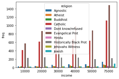
Each seaborn visualization functions has a “data” keyword to which you pass your dataframe, and then a few other with which you specify the relations of the columns to one another. Look how simple it was to receive this beautiful bar chart.
_ = sns.catplot(data=tidy_df, x="religion", y="freq", hue="income")
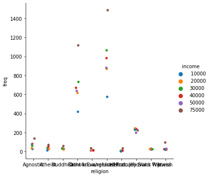
Seaborn also takes care of faceting the data for us:
_ = sns.catplot(data=tidy_df, x="religion", y="freq", hue="income", col="income")

Figure is a bit small? We can use matplotlib to change it:
_, ax = plt.subplots(figsize=(25, 8))
_ = sns.stripplot(data=tidy_df, x="religion", y="freq", hue="income", ax=ax)

Simpler data can also be visualized, no need for categorical variables:
simple_df = pd.DataFrame(np.random.random((1000, 4)), columns=list('abcd'))
simple_df
| a | b | c | d | |
|---|---|---|---|---|
| 0 | 0.667391 | 0.010051 | 0.967742 | 0.548874 |
| 1 | 0.157438 | 0.950683 | 0.713497 | 0.765294 |
| 2 | 0.998489 | 0.013486 | 0.770482 | 0.998116 |
| 3 | 0.196658 | 0.949204 | 0.470956 | 0.387366 |
| 4 | 0.964784 | 0.245307 | 0.156812 | 0.348655 |
| ... | ... | ... | ... | ... |
| 995 | 0.999568 | 0.919543 | 0.751349 | 0.255158 |
| 996 | 0.147531 | 0.703554 | 0.527639 | 0.059873 |
| 997 | 0.112191 | 0.145381 | 0.432280 | 0.599502 |
| 998 | 0.578287 | 0.656216 | 0.948502 | 0.763731 |
| 999 | 0.578834 | 0.263214 | 0.002397 | 0.641179 |
1000 rows × 4 columns
_ = sns.jointplot(data=simple_df, x='a', y='b', kind='kde')
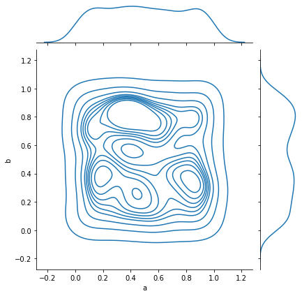
And complex relations can also be visualized:
_ = sns.pairplot(data=simple_df)
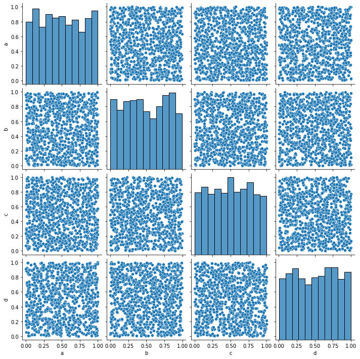
Seaborn should probably be your go-to choice when all you need is a 2D graph.
Higher Dimensionality: xarray
Pandas is amazing, but has its limits. A DataFrame can be a multi-dimensional container when using a MultiIndex, but it’s limited to a subset of uses in which another layer of indexing makes sense.
In many occasions, however, our data is truly high-dimensional. A simple case could be electro-physiological recordings, or calcium traces. In these cases we have several indices (some can be categorical), like “Sex”, “AnimalID”, “Date”, “TypeOfExperiment” and perhaps a few more. But the data itself is a vector of numbers representing voltage or fluorescence. Having this data in a dataframe seems a bit “off”, what are the columns on this dataframe? Is each column a voltage measurement? Or if each column is a measurement, how do you deal with the indices? We can use nested columns (MultiIndex the columns), but it’s not a very modular approach.
This is a classic example where pandas’ dataframes “fail”, and indeed pandas used to have a higher-dimensionality container named Panel. However, in late 2016 pandas developers deprecated it, publicly announcing that they intend to drop support for Panels sometime in the future, and whoever needs a higher-dimensionality container should use xarray.
xarray is a labeled n-dimensional array. Just like a DataFrame is a labeled 2D array, i.e. with names to its axes rather than numbers, in xarray each dimension has a name (time, temp, voltage) and its indices (“coordinates”) can also have labels (like a timestamp, for example). In addition, each xarray object also has metadata attached to it, in which we can write details that do not fit a columnar structure (experimenter name, hardware and software used for acquisition, etc.).
DataArray
import numpy as np
import xarray as xr

da = xr.DataArray(np.random.random((10, 2)))
da
<xarray.DataArray (dim_0: 10, dim_1: 2)>
array([[0.76710682, 0.36284118],
       [0.88509317, 0.81818341],
       [0.18340391, 0.55294034],
       [0.96196972, 0.57340623],
       [0.4966008 , 0.69097988],
       [0.33836287, 0.24248999],
       [0.18536431, 0.68307787],
       [0.97781987, 0.70801615],
       [0.33653568, 0.66063411],
       [0.76039457, 0.08973155]])
Dimensions without coordinates: dim_0, dim_1- dim_0: 10
- dim_1: 2
- 0.7671 0.3628 0.8851 0.8182 0.1834 ... 0.3365 0.6606 0.7604 0.08973
array([[0.76710682, 0.36284118],
       [0.88509317, 0.81818341],
       [0.18340391, 0.55294034],
       [0.96196972, 0.57340623],
       [0.4966008 , 0.69097988],
       [0.33836287, 0.24248999],
       [0.18536431, 0.68307787],
       [0.97781987, 0.70801615],
       [0.33653568, 0.66063411],
       [0.76039457, 0.08973155]])
The basic building block of xarray is a DataArray, an n-dimensional counter part of a pandas’ Series. It has two dimensions, just like the numpy array that its based upon. We didn’t specify names for these dimensions, so currently they’re called dim_0 and dim_1. We also didn’t specify coordinates (indices), so the printout doesn’t report of any coordinates for the data.
da.values # just like pandas
array([[0.76710682, 0.36284118],
       [0.88509317, 0.81818341],
       [0.18340391, 0.55294034],
       [0.96196972, 0.57340623],
       [0.4966008 , 0.69097988],
       [0.33836287, 0.24248999],
       [0.18536431, 0.68307787],
       [0.97781987, 0.70801615],
       [0.33653568, 0.66063411],
       [0.76039457, 0.08973155]])
da.coords
Coordinates:
    *empty*
da.dims
('dim_0', 'dim_1')
da.attrs
{}
We’ll add coordinates and dimension names and see how indexing works:
dims = ('time', 'repetition')
coords = {'time': np.linspace(0, 1, num=10),
          'repetition': np.arange(2)}
da2 = xr.DataArray(np.random.random((10, 2)), dims=dims, coords=coords)
da2
<xarray.DataArray (time: 10, repetition: 2)>
array([[0.55413914, 0.89628425],
       [0.25071287, 0.49845141],
       [0.4969969 , 0.12442973],
       [0.31954646, 0.18987736],
       [0.89001191, 0.32246897],
       [0.78751759, 0.79093426],
       [0.11219818, 0.17748517],
       [0.78563883, 0.91806162],
       [0.73410558, 0.45739219],
       [0.47090954, 0.69147558]])
Coordinates:
  * time        (time) float64 0.0 0.1111 0.2222 0.3333 ... 0.7778 0.8889 1.0
* repetition (repetition) int64 0 1- time: 10
- repetition: 2
- 0.5541 0.8963 0.2507 0.4985 0.497 ... 0.7341 0.4574 0.4709 0.6915
array([[0.55413914, 0.89628425], [0.25071287, 0.49845141], [0.4969969 , 0.12442973], [0.31954646, 0.18987736], [0.89001191, 0.32246897], [0.78751759, 0.79093426], [0.11219818, 0.17748517], [0.78563883, 0.91806162], [0.73410558, 0.45739219], [0.47090954, 0.69147558]]) - time(time)float640.0 0.1111 0.2222 ... 0.8889 1.0
array([0. , 0.111111, 0.222222, 0.333333, 0.444444, 0.555556, 0.666667, 0.777778, 0.888889, 1. ]) - repetition(repetition)int640 1
array([0, 1])
da2.loc[0.1:0.3, 1] # rows 1-2 in the second column
<xarray.DataArray (time: 2)>
array([0.49845141, 0.12442973])
Coordinates:
  * time        (time) float64 0.1111 0.2222
repetition int64 1- time: 2
- 0.4985 0.1244
array([0.49845141, 0.12442973])
- time(time)float640.1111 0.2222
array([0.111111, 0.222222])
- repetition()int641
array(1)
da2.isel(time=slice(3, 7)) # dimension name and integer label (sel = select)
<xarray.DataArray (time: 4, repetition: 2)>
array([[0.31954646, 0.18987736],
       [0.89001191, 0.32246897],
       [0.78751759, 0.79093426],
       [0.11219818, 0.17748517]])
Coordinates:
  * time        (time) float64 0.3333 0.4444 0.5556 0.6667
* repetition (repetition) int64 0 1- time: 4
- repetition: 2
- 0.3195 0.1899 0.89 0.3225 0.7875 0.7909 0.1122 0.1775
array([[0.31954646, 0.18987736], [0.89001191, 0.32246897], [0.78751759, 0.79093426], [0.11219818, 0.17748517]]) - time(time)float640.3333 0.4444 0.5556 0.6667
array([0.333333, 0.444444, 0.555556, 0.666667])
- repetition(repetition)int640 1
array([0, 1])
da2.sel(time=slice(0.1, 0.3), repetition=[1]) # dimension name and coordinate label
<xarray.DataArray (time: 2, repetition: 1)>
array([[0.49845141],
       [0.12442973]])
Coordinates:
  * time        (time) float64 0.1111 0.2222
* repetition (repetition) int64 1- time: 2
- repetition: 1
- 0.4985 0.1244
array([[0.49845141], [0.12442973]]) - time(time)float640.1111 0.2222
array([0.111111, 0.222222])
- repetition(repetition)int641
array([1])
Other operations on DataArray instances, such as computations, grouping and such, are done very similarly to dataframes and numpy arrays.
Dataset
A Dataset is to a DataArray what a DataFrame is to a Series. In other words, it’s a collection of DataArray instances that share coordinates.
da2 # a reminder. We notice that this could've been a DataFrame as well
<xarray.DataArray (time: 10, repetition: 2)>
array([[0.55413914, 0.89628425],
       [0.25071287, 0.49845141],
       [0.4969969 , 0.12442973],
       [0.31954646, 0.18987736],
       [0.89001191, 0.32246897],
       [0.78751759, 0.79093426],
       [0.11219818, 0.17748517],
       [0.78563883, 0.91806162],
       [0.73410558, 0.45739219],
       [0.47090954, 0.69147558]])
Coordinates:
  * time        (time) float64 0.0 0.1111 0.2222 0.3333 ... 0.7778 0.8889 1.0
* repetition (repetition) int64 0 1- time: 10
- repetition: 2
- 0.5541 0.8963 0.2507 0.4985 0.497 ... 0.7341 0.4574 0.4709 0.6915
array([[0.55413914, 0.89628425], [0.25071287, 0.49845141], [0.4969969 , 0.12442973], [0.31954646, 0.18987736], [0.89001191, 0.32246897], [0.78751759, 0.79093426], [0.11219818, 0.17748517], [0.78563883, 0.91806162], [0.73410558, 0.45739219], [0.47090954, 0.69147558]]) - time(time)float640.0 0.1111 0.2222 ... 0.8889 1.0
array([0. , 0.111111, 0.222222, 0.333333, 0.444444, 0.555556, 0.666667, 0.777778, 0.888889, 1. ]) - repetition(repetition)int640 1
array([0, 1])
ds = xr.Dataset({'ephys': da2,
                 'calcium': ('time', np.random.random(10))},
                attrs={'AnimalD': 701,
                       'ExperimentType': 'double',
                       'Sex': 'Male'})
ds
<xarray.Dataset>
Dimensions:     (repetition: 2, time: 10)
Coordinates:
  * time        (time) float64 0.0 0.1111 0.2222 0.3333 ... 0.7778 0.8889 1.0
  * repetition  (repetition) int64 0 1
Data variables:
    ephys       (time, repetition) float64 0.5541 0.8963 ... 0.4709 0.6915
    calcium     (time) float64 0.7889 0.3533 0.456 ... 0.4037 0.9326 0.9088
Attributes:
    AnimalD:         701
    ExperimentType:  double
Sex: Male- repetition: 2
- time: 10
- time(time)float640.0 0.1111 0.2222 ... 0.8889 1.0
array([0. , 0.111111, 0.222222, 0.333333, 0.444444, 0.555556, 0.666667, 0.777778, 0.888889, 1. ]) - repetition(repetition)int640 1
array([0, 1])
- ephys(time, repetition)float640.5541 0.8963 ... 0.4709 0.6915
array([[0.55413914, 0.89628425], [0.25071287, 0.49845141], [0.4969969 , 0.12442973], [0.31954646, 0.18987736], [0.89001191, 0.32246897], [0.78751759, 0.79093426], [0.11219818, 0.17748517], [0.78563883, 0.91806162], [0.73410558, 0.45739219], [0.47090954, 0.69147558]]) - calcium(time)float640.7889 0.3533 ... 0.9326 0.9088
array([0.78886409, 0.35326476, 0.45596866, 0.92742934, 0.70786443,
       0.12727393, 0.59165603, 0.40368302, 0.93263646, 0.90876202])
- AnimalD :
- 701
- ExperimentType :
- double
- Sex :
- Male
ds['ephys'] # individual DataArrays can be dissimilar in shape
<xarray.DataArray 'ephys' (time: 10, repetition: 2)>
array([[0.55413914, 0.89628425],
       [0.25071287, 0.49845141],
       [0.4969969 , 0.12442973],
       [0.31954646, 0.18987736],
       [0.89001191, 0.32246897],
       [0.78751759, 0.79093426],
       [0.11219818, 0.17748517],
       [0.78563883, 0.91806162],
       [0.73410558, 0.45739219],
       [0.47090954, 0.69147558]])
Coordinates:
  * time        (time) float64 0.0 0.1111 0.2222 0.3333 ... 0.7778 0.8889 1.0
* repetition (repetition) int64 0 1- time: 10
- repetition: 2
- 0.5541 0.8963 0.2507 0.4985 0.497 ... 0.7341 0.4574 0.4709 0.6915
array([[0.55413914, 0.89628425], [0.25071287, 0.49845141], [0.4969969 , 0.12442973], [0.31954646, 0.18987736], [0.89001191, 0.32246897], [0.78751759, 0.79093426], [0.11219818, 0.17748517], [0.78563883, 0.91806162], [0.73410558, 0.45739219], [0.47090954, 0.69147558]]) - time(time)float640.0 0.1111 0.2222 ... 0.8889 1.0
array([0. , 0.111111, 0.222222, 0.333333, 0.444444, 0.555556, 0.666667, 0.777778, 0.888889, 1. ]) - repetition(repetition)int640 1
array([0, 1])
Exercise: Rat Visual Stimulus Experiment Database
You’re measuring the potential of neurons in a rat’s brain over time in response to flashes of light using a multi-electrode array surgically inserted into the rat’s skull. Each trial is two seconds long, and one second into the trial a short, 100 ms, bright light is flashed at the animal. After 30 seconds the experiment is replicated, for a total of 4 repetitions. The relevant parameters are the following:
Rat ID.
Experimenter name.
Rat gender.
Measured voltage (10 electrode, 10k samples representing two seconds).
Stimulus index (mark differently the pre-, during- and post-stimulus time).
Repetition number.
Mock data and model it, you can add more parameters if you feel so.
Experimental timeline:
       1s          100ms             0.9s             30s
Start -----> Flash -----> End flash -----> End trial -----> New trial
|                                                                    |
|--------------------------------------------------------------------|
                                   x4
Methods and functions to implement
There should be a class holding this data table,
VisualStimData, alongside several methods for the analysis of the data. The class should have adataattribute containing the data table, in axarray.DataArrayor axarray.Dataset.Write a function (not a method) that returns an instance of the class with mock data.
def mock_stim_data() -> VisualStimData:
    """ Creates a new VisualStimData instance with mock data """
When simulating the recorded voltage, it’s completely fine to not model spikes precisely, with leaky integration and so forth - randoming numbers and treating them as the recorded neural potential is fine. There are quite a few ways to model real neurons, if so you wish, brian being one of them. If your own research will benefit from knowing how to use these tools, this exercise is a great place to start familiarizing yourself with them.
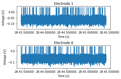
Write a method that receives a repetition number, rat ID, and a list of electrode numbers, and plots the voltage recorded from these electrodes. The single figure should be divided into however many plots needed, depending on the length of the list of electrode numbers.
def plot_electrode(self, rep_number: int, rat_id: int, elec_number: tuple=(0,)):
    """
    Plots the voltage of the electrodes in "elec_number" for the rat "rat_id" in the repetition
    "rep_number". Shows a single figure with subplots.
    """
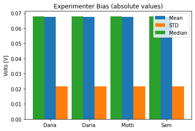
To see if the different experimenters influence the measurements, write a method that calculates the mean, standard deviation and median of the average voltage trace across all repetitions, for each experimenter, and shows a bar plot of it.
def experimenter_bias(self):
    """ Shows the statistics of the average recording across all experimenters """
Exercise solutions below…
import xarray as xr
import numpy as np
import pandas as pd
import matplotlib.pyplot as plt


class VisualStimData:
    """
    Data and methods for the visual stimulus ePhys experiment.
    The data table itself is held in self.data, an `xarray` object.
    Inputs:
        data: xr.DataArray or xr.Dataset
    Methods:
         ...
    """
    def __init__(self, data: xr.Dataset, ):
        assert isinstance(data, xr.Dataset)
        self.data = data


    def plot_electrode(self, rep_number: int, rat_id: int, elec_number: tuple=(0,)):
        """
        Plots the voltage of the electrodes in "elec_number" for the rat "rat_id" in the repetition
        "rep_number". Shows a single figure with two subplots, for male and female rats.
        """
        fig, axes = plt.subplots(len(elec_number), 1)
        axes = np.array([axes]) if isinstance(axes, plt.Axes) else axes
        time = self.data['time']
        for ax, elec in zip(axes, elec_number):
            to_plot = self.data.sel(rep=rep_number, rat_id=rat_id, elec=elec)['volt'].values
            ax.plot(time, to_plot)
            ax.set_xlabel('Time [s]')
            ax.set_ylabel('Voltage [V]')
            ax.set_title(f'Electrode {elec}')

        fig.tight_layout()

    def experimenter_bias(self):
        """ Shows the statistics of the average recording across all experimenters """
        names = np.unique(self.data.coords['exp_name'].values)
        means = []
        stds = []
        medians = []
        for experimenter in names:
            data = self.data.sel(exp_name=experimenter)['volt'].values
            means.append(np.abs(data.mean()))
            stds.append(np.abs(data.std()))
            medians.append(np.abs(np.median(data)))

        # Plotting
        fig, ax = plt.subplots()
        x_locs = np.arange(len(names))
        width = 0.3
        rect0 = ax.bar(x_locs, means, width, color='C0')
        rect1 = ax.bar(x_locs + width, stds, width, color='C1')
        rect2 = ax.bar(x_locs - width, medians, width, color='C2')

        ax.set_xticks(x_locs)
        ax.set_xticklabels(names)
        ax.legend((rect0[0], rect1[0], rect2[0]), ('Mean', 'STD', 'Median'))
        ax.set_title('Experimenter Bias (absolute values)')
        ax.set_ylabel('Volts [V]')
def mock_stim_data() -> VisualStimData:
    """ Creates a new VisualStimData instance with mock data """
    num_of_animals = 20
    num_of_reps = 4
    reps = np.arange(num_of_reps, dtype=np.uint8)
    total_num_of_exp = num_of_animals * num_of_reps
    exp_number = np.arange(total_num_of_exp, dtype=np.uint32)

    rat_id_ints, rat_id = _generate_rat_data(num_of_animals)
    room_temp, room_humid = _generate_temp_hum_values(total_num_of_exp)
    experimenters = _generate_experimenter_names(num_of_animals, num_of_reps)
    rat_sex = _generate_rat_gender(num_of_animals, num_of_reps)
    stim, electrode_array, time, volt = _generate_voltage_stim(num_of_animals, num_of_reps)

    # Construct the Dataset - this could be done with a pd.MultiIndex as well
    ds = xr.Dataset({'temp': (['num'], room_temp),
                     'humid': (['num'], room_humid),
                     'volt': (['elec', 'time', 'rat_id', 'rep'], volt),
                     'stim': (['time'], stim)},
                    coords={'elec': electrode_array,
                            'time': time,
                            'rat_id': rat_id,
                            'rep': reps,
                            'exp_name': experimenters,
                            'sex': rat_sex,
                            'num': exp_number,
                            })

    ds.attrs['exp_date'] = pd.to_datetime('today')
    ds.attrs['rat_strain'] = 'Sprague Dawley'

    return VisualStimData(ds)

def _generate_rat_data(num_of_animals):
    rat_id_ints = np.random.choice(np.arange(100, 900), size=300, replace=False)
    rat_id = np.random.choice(rat_id_ints, size=num_of_animals, replace=False)
    return rat_id_ints, rat_id


def _generate_temp_hum_values(total_num_of_exp):
    room_temp = np.random.random(total_num_of_exp) * 3 + 23  # between 23 and 26 C
    room_humid = np.random.randint(30, 70, size=total_num_of_exp)
    return room_temp, room_humid

def _generate_experimenter_names(num_of_animals, num_of_reps):
    names = ['Dana', 'Motti', 'Sam', 'Daria']
    experimenters = np.random.choice(names, size=num_of_animals, replace=True)
    experimenters = np.tile(experimenters, num_of_reps)
    return experimenters

def _generate_rat_gender(num_of_animals, num_of_reps):
    sex = ['F', 'M']
    rat_sex = np.random.choice(sex, size=num_of_animals, replace=True)
    rat_sex = np.tile(rat_sex, num_of_reps)
    return rat_sex


def _generate_voltage_stim(num_of_animals, num_of_reps):
    pre_stim = 1  # seconds
    stim_time = 0.1  # seconds
    post_stim = 0.9  # seconds
    sampling_rate = 5000  # Hz
    freq = 1 / sampling_rate
    experiment_length = int(pre_stim + stim_time + post_stim)
    electrodes = 10
    samples = sampling_rate * experiment_length

    # Random voltage values from N(0.068, 0.0004)
    volt = 0.02 * np.random.randn(electrodes, samples, num_of_animals,
                                 num_of_reps).astype(np.float32) - 0.068  # in volts, not millivolts
    volt[volt > -0.02] = 0.04  # "spikes"
    time = pd.date_range(start=pd.to_datetime('today'), periods=experiment_length * sampling_rate,
                         freq=f'{freq}S')
    electrode_array = np.arange(electrodes, dtype=np.uint16)

    # Stim index - -1 is pre, 0 is stim, 1 is post
    stim = np.zeros(int(samples), dtype=np.int8)
    stim[:int(pre_stim*sampling_rate)] = -1
    stim[int((pre_stim + stim_time)*sampling_rate):] += 1
    return stim, electrode_array, time, volt
# Run the solution
stim_data = mock_stim_data()
ids = stim_data.data['rat_id']
arr = stim_data.plot_electrode(rep_number=2, rat_id=ids[0], elec_number=(1, 6))
stim_data.experimenter_bias()
stim_data.data
<xarray.Dataset>
Dimensions:   (elec: 10, exp_name: 80, num: 80, rat_id: 20, rep: 4, sex: 80, time: 10000)
Coordinates:
  * elec      (elec) uint16 0 1 2 3 4 5 6 7 8 9
  * time      (time) datetime64[ns] 2021-05-03T12:28:43.424704 ... 2021-05-03...
  * rat_id    (rat_id) int64 189 361 195 819 376 543 ... 722 371 853 680 416 413
  * rep       (rep) uint8 0 1 2 3
  * exp_name  (exp_name) <U5 'Dana' 'Motti' 'Daria' 'Sam' ... 'Dana' 'Sam' 'Sam'
  * sex       (sex) <U1 'M' 'F' 'F' 'M' 'M' 'F' 'F' ... 'M' 'F' 'M' 'M' 'F' 'F'
  * num       (num) uint32 0 1 2 3 4 5 6 7 8 9 ... 70 71 72 73 74 75 76 77 78 79
Data variables:
    temp      (num) float64 24.25 23.91 25.94 25.29 ... 24.91 23.28 24.89 23.18
    humid     (num) int64 51 49 55 36 60 56 33 34 54 ... 40 51 45 41 55 57 46 51
    volt      (elec, time, rat_id, rep) float32 -0.07908 -0.05604 ... -0.0422
    stim      (time) int8 -1 -1 -1 -1 -1 -1 -1 -1 -1 -1 ... 1 1 1 1 1 1 1 1 1 1
Attributes:
    exp_date:    2021-05-03 12:28:43.428048
rat_strain: Sprague Dawley- elec: 10
- exp_name: 80
- num: 80
- rat_id: 20
- rep: 4
- sex: 80
- time: 10000
- elec(elec)uint160 1 2 3 4 5 6 7 8 9
array([0, 1, 2, 3, 4, 5, 6, 7, 8, 9], dtype=uint16)
- time(time)datetime64[ns]2021-05-03T12:28:43.424704 ... 2...
array(['2021-05-03T12:28:43.424704000', '2021-05-03T12:28:43.424904000', '2021-05-03T12:28:43.425104000', ..., '2021-05-03T12:28:45.424104000', '2021-05-03T12:28:45.424304000', '2021-05-03T12:28:45.424504000'], dtype='datetime64[ns]') - rat_id(rat_id)int64189 361 195 819 ... 853 680 416 413
array([189, 361, 195, 819, 376, 543, 386, 783, 285, 424, 229, 650, 586, 500, 722, 371, 853, 680, 416, 413]) - rep(rep)uint80 1 2 3
array([0, 1, 2, 3], dtype=uint8)
- exp_name(exp_name)<U5'Dana' 'Motti' ... 'Sam' 'Sam'
array(['Dana', 'Motti', 'Daria', 'Sam', 'Motti', 'Motti', 'Motti', 'Dana', 'Daria', 'Dana', 'Motti', 'Motti', 'Daria', 'Dana', 'Sam', 'Dana', 'Sam', 'Dana', 'Sam', 'Sam', 'Dana', 'Motti', 'Daria', 'Sam', 'Motti', 'Motti', 'Motti', 'Dana', 'Daria', 'Dana', 'Motti', 'Motti', 'Daria', 'Dana', 'Sam', 'Dana', 'Sam', 'Dana', 'Sam', 'Sam', 'Dana', 'Motti', 'Daria', 'Sam', 'Motti', 'Motti', 'Motti', 'Dana', 'Daria', 'Dana', 'Motti', 'Motti', 'Daria', 'Dana', 'Sam', 'Dana', 'Sam', 'Dana', 'Sam', 'Sam', 'Dana', 'Motti', 'Daria', 'Sam', 'Motti', 'Motti', 'Motti', 'Dana', 'Daria', 'Dana', 'Motti', 'Motti', 'Daria', 'Dana', 'Sam', 'Dana', 'Sam', 'Dana', 'Sam', 'Sam'], dtype='<U5') - sex(sex)<U1'M' 'F' 'F' 'M' ... 'M' 'M' 'F' 'F'
array(['M', 'F', 'F', 'M', 'M', 'F', 'F', 'M', 'F', 'M', 'M', 'M', 'M', 'M', 'M', 'F', 'M', 'M', 'F', 'F', 'M', 'F', 'F', 'M', 'M', 'F', 'F', 'M', 'F', 'M', 'M', 'M', 'M', 'M', 'M', 'F', 'M', 'M', 'F', 'F', 'M', 'F', 'F', 'M', 'M', 'F', 'F', 'M', 'F', 'M', 'M', 'M', 'M', 'M', 'M', 'F', 'M', 'M', 'F', 'F', 'M', 'F', 'F', 'M', 'M', 'F', 'F', 'M', 'F', 'M', 'M', 'M', 'M', 'M', 'M', 'F', 'M', 'M', 'F', 'F'], dtype='<U1') - num(num)uint320 1 2 3 4 5 6 ... 74 75 76 77 78 79
array([ 0,  1,  2,  3,  4,  5,  6,  7,  8,  9, 10, 11, 12, 13, 14, 15, 16, 17,
       18, 19, 20, 21, 22, 23, 24, 25, 26, 27, 28, 29, 30, 31, 32, 33, 34, 35,
       36, 37, 38, 39, 40, 41, 42, 43, 44, 45, 46, 47, 48, 49, 50, 51, 52, 53,
       54, 55, 56, 57, 58, 59, 60, 61, 62, 63, 64, 65, 66, 67, 68, 69, 70, 71,
       72, 73, 74, 75, 76, 77, 78, 79], dtype=uint32)
- temp(num)float6424.25 23.91 25.94 ... 24.89 23.18
array([24.25315913, 23.9058603 , 25.93933156, 25.28616513, 24.88585737, 24.75536388, 24.10843539, 25.51457452, 24.19595355, 25.41786186, 24.08444531, 25.21627387, 24.29941247, 24.78377602, 24.06656058, 23.59785392, 25.06831805, 25.94950573, 24.66458497, 24.77785171, 25.77236427, 24.6330683 , 24.79820195, 25.28349032, 24.03816501, 24.23699313, 24.74561247, 25.50707598, 24.18077992, 23.02103128, 24.02186159, 24.87587133, 25.24235554, 23.44378112, 25.34879604, 24.49279046, 24.84173468, 24.2632728 , 25.89604571, 24.1502254 , 25.28466047, 24.56677704, 24.34226551, 24.83625427, 25.98778036, 25.99038499, 24.76106323, 25.06689772, 23.03780963, 25.93161258, 24.18161433, 24.56399804, 24.61883778, 25.73594465, 23.49219813, 25.55216801, 23.73352485, 24.3574682 , 23.54606859, 24.83444472, 23.90615264, 23.69261884, 25.79488121, 23.39292349, 23.84393163, 24.6764572 , 23.31933651, 23.82306766, 23.95515232, 24.587429 , 23.01724922, 25.82255196, 25.18989434, 25.01794884, 25.50447602, 25.44194381, 24.91472645, 23.28135571, 24.89152671, 23.18064219]) - humid(num)int6451 49 55 36 60 ... 41 55 57 46 51
array([51, 49, 55, 36, 60, 56, 33, 34, 54, 65, 35, 61, 30, 48, 61, 60, 34, 56, 32, 43, 68, 48, 59, 60, 56, 38, 37, 57, 33, 50, 31, 33, 33, 55, 57, 40, 41, 54, 51, 47, 44, 32, 68, 55, 40, 60, 54, 39, 35, 44, 31, 47, 37, 32, 38, 69, 47, 49, 33, 66, 30, 36, 65, 59, 55, 47, 46, 34, 47, 46, 49, 42, 40, 51, 45, 41, 55, 57, 46, 51]) - volt(elec, time, rat_id, rep)float32-0.07908 -0.05604 ... -0.0422
array([[[[-0.07908148, -0.05603592, -0.11035364, -0.07274903], [-0.08596846, -0.09094156, -0.10445387, -0.08744499], [-0.05290633, -0.03366939, -0.03790763, -0.05580071], ..., [-0.04800835, -0.06058828, -0.05274715, -0.10236326], [-0.08905949, -0.06246805, -0.07201247, -0.04576826], [-0.09204988, -0.02966017, -0.08330008, -0.06764071]], [[-0.08397806, -0.05185492, -0.08370727, -0.09058541], [-0.05088569, -0.06759453, -0.06847324, -0.07146221], [-0.07750509, -0.06847045, -0.07462021, -0.07087509], ..., [-0.10707647, -0.08300266, -0.0448891 , -0.06014562], [-0.0421927 , -0.03307082, -0.05071332, -0.07714726], [-0.07017247, -0.04995182, -0.06952386, -0.08339352]], [[-0.10103403, -0.03863041, -0.08542077, -0.08858324], [-0.06154377, -0.10151297, -0.06473783, -0.10257123], [-0.10091453, -0.07089943, -0.05282057, -0.09248852], ..., ... [-0.06632698, -0.04196646, -0.09773733, -0.05096807], [-0.06156045, -0.04634427, -0.09190307, -0.08404775], [-0.08845219, -0.04570177, -0.05648797, -0.08709496]], [[-0.05387374, -0.06677914, -0.06900453, -0.04608899], [-0.07205393, -0.04555608, -0.06761038, -0.09011044], [-0.09138654, -0.05940337, -0.06236728, -0.06957153], ..., [-0.06828292, -0.06918196, -0.06010472, -0.08990856], [-0.05471881, -0.05000793, -0.06301855, -0.03285873], [-0.08880606, -0.06368613, -0.0826819 , -0.09551728]], [[-0.0553524 , -0.04176162, -0.06015503, -0.06523232], [-0.08821956, -0.06811102, -0.07952822, -0.04030491], [-0.09058222, -0.06635788, -0.08860535, -0.08393432], ..., [-0.08268929, -0.04122622, -0.05534643, -0.06993402], [-0.05279263, -0.03997236, -0.06803154, -0.07886719], [-0.06556851, -0.04923081, -0.08203096, -0.04219805]]]], dtype=float32) - stim(time)int8-1 -1 -1 -1 -1 -1 ... 1 1 1 1 1 1
array([-1, -1, -1, ..., 1, 1, 1], dtype=int8)
- exp_date :
- 2021-05-03 12:28:43.428048
- rat_strain :
- Sprague Dawley
