Exercise VIII: K-Means Clustering and PCA
Iris Dataset
Let’s start things off with a simple application of our subject material on the Iris dataset to better understand our workflow and the relevant metrics.
Set up
import pandas as pd

from sklearn.datasets import load_iris


data = load_iris(as_frame=True)

X_iris, y_iris = data.data, data.target
y_iris = y_iris.replace(
    {index: name
     for index, name in enumerate(data["target_names"])})
Dimensionality Reduction using Principal Component Analysis (PCA)
from sklearn.decomposition import PCA

IRIS_N_COMPONENTS = X_iris.shape[1] - 1

iris_pca = PCA(n_components=IRIS_N_COMPONENTS)
_ = iris_pca.fit(X_iris)
Let’s try and evaluate how well did PCA manage to find small number of components to explain the variance:
plots/utils.py
"""
Provides utility functions for creating plots in exercise 8.
"""
from typing import Union


def organize_kwargs(
    user_kwargs: Union[dict, None], default_kwargs: dict = None
) -> dict:
    """
    Update default keyword argument configuration with user provided
    configuration.

    Parameters
    ----------
    user_kwargs: Union[dict, None]
        Dictionary of user provided keyword argument configurations, or
        None
    default_kwargs: dict
        Default keyword argument configuration to be updated with user
        configuration

    Returns
    -------
    dict
        Complete keyword argument configuration
    """
    kwargs = user_kwargs or {}
    default_kwargs = default_kwargs or {}
    return {**default_kwargs, **kwargs}
plots/explained_variance.py
"""
Functions creating plots to evaluate explained variance.
"""
import matplotlib.pyplot as plt
import numpy as np
import pandas as pd

from plots.utils import organize_kwargs
from sklearn.decomposition import PCA


DEFAULT_FIG_KWARGS = {"figsize": (9, 6)}
DEFAULT_COMPONENT_AX_KWARGS = {
    "color": "purple",
    "linewidth": 2,
    "label": "Individual Component",
}
DEFAULT_CUMULATIVE_AX_KWARGS = {
    "color": "orange",
    "linewidth": 2,
    "label": "Cumulative",
}
DEFAULT_CUSTOMIZATIONS = {
    "title": "Explained Variance Ratio by Number of Principal Components",
    "xlabel": "Number of Principal Components",
    "ylabel": "Explained Variance Ratio",
}
DEFAULT_LEGEND_LOCATION = (0.85, 0.7)


def plot_explained_variance_ratio(
    pca: PCA,
    fig_kwargs: dict = None,
    component_ax_kwargs: dict = None,
    cumulative_ax_kwargs: dict = None,
    customizations: dict = None,
    legend_location: tuple = DEFAULT_LEGEND_LOCATION,
) -> tuple:
    """
    Plot explained variance by component number for a fitted PCA estimator.

    Parameters
    ----------
    pca : PCA
        Fitted PCA model
    fig_kwargs : dict
        Keyword arguments passed to the created figure
    component_ax_kwargs : dict
        Keyword arguments passed in the explained variance by individual
        component plot call
    cumulative_ax_kwargs : dict
        Keyword arguments passed in the cumulative explained variance by
        component plot call
    customizations : dict
        Keyword arguments passed to the axis' `set()` method
    legend_location: Tuple(float, float)
        Legend location within figure

    Returns
    -------
    Tuple(Figure, Axes)
        Create figure and axes
    """
    # Prepare figure and axes kwargs
    fig_kwargs = organize_kwargs(fig_kwargs, DEFAULT_FIG_KWARGS)
    component_ax_kwargs = organize_kwargs(
        component_ax_kwargs, DEFAULT_COMPONENT_AX_KWARGS
    )
    cumulative_ax_kwargs = organize_kwargs(
        cumulative_ax_kwargs, DEFAULT_CUMULATIVE_AX_KWARGS
    )
    customizations = organize_kwargs(customizations, DEFAULT_CUSTOMIZATIONS)

    # Create figure
    fig, ax = plt.subplots(**fig_kwargs)

    # Plot explained variance ratio by component
    x_range = range(1, pca.n_components_ + 1)
    ax.plot(x_range, pca.explained_variance_ratio_, **component_ax_kwargs)

    # Plot cumulative explained variance
    cumulative_sum = np.cumsum(pca.explained_variance_ratio_)
    ax.plot(x_range, cumulative_sum, **cumulative_ax_kwargs)

    #
    # Customizations
    #
    ax.set(**customizations)

    # Add legend
    fig.legend(bbox_to_anchor=legend_location)

    # Fix x-axis tick labels to show integers
    ax.set_xticks(x_range)
    ax.set_xticklabels(x_range)

    return fig, ax


def create_explained_variance_df(pca: PCA) -> pd.DataFrame:
    """
    Create a formatted dataframe to display the plot's information
    conveniently.

    Parameters
    ----------
    pca : PCA
        Fitted PCA model

    Returns
    -------
    pd.DataFrame
        Explained variance (per component and cumulative)
    """
    results_dict = {
        "Individual Component": pca.explained_variance_ratio_,
        "Cumulative": np.cumsum(pca.explained_variance_ratio_),
    }
    index = range(1, pca.n_components_ + 1)
    df = pd.DataFrame(results_dict, index=index)
    df.index.name = "# Components"
    return df
import matplotlib.pyplot as plt
import numpy as np

from plots.explained_variance import create_explained_variance_df, plot_explained_variance_ratio


# Create explained variance ratio figure
fig_kwargs = {"figsize": (6, 6)}
iris_explained_variance_fig, iris_explained_variance_ax = plot_explained_variance_ratio(
    iris_pca, fig_kwargs=fig_kwargs)

# Create explained variance ratio dataframe
explained_variance_df = create_explained_variance_df(iris_pca)
| Individual Component | Cumulative | |
|---|---|---|
| # Components | ||
| 1 | 0.924619 | 0.924619 |
| 2 | 0.053066 | 0.977685 |
| 3 | 0.017103 | 0.994788 |
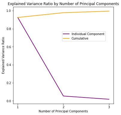
We’ve managed to capture 97.77% of the variance using only 2 components, and 99.48% percent using 3, not bad at all!
To calculate the coordinates of the dataset in the dimensions of the calculated principal components, we have to call tranform():
X_iris_reduced = iris_pca.transform(X_iris)
X_iris_reduced.shape
(150, 3)
Note
As with many other classes that implement this general procedure, sklearn also provides a fit_transform() function to do both more conveniently.
Fortunately, 2 and 3 dimensions are also simple enough to visualize:
plots/pca_scatter.py
import matplotlib.pyplot as plt
import numpy as np
from ipywidgets import interact

DEFAULT_TITLE = "Dataset Projected Over {n_dimensions} Dimensions Using PCA"
PCA_AXIS_LABELS_2D = {
    "xlabel": "Principal Component #1",
    "ylabel": "Principal Component #2",
}
PCA_AXIS_LABELS_3D = {
    "xlabel": "Principal Component #1",
    "ylabel": "Principal Component #2",
    "zlabel": "Principal Component #3",
}


def plot_reduced(
    X_reduced: np.ndarray,
    classification_labels: np.ndarray = None,
    true_labels: np.ndarray = None,
    title: str = None,
) -> None:
    """
    Plots a 3D or 2D scatter plot of *X_reduced*, potentially colored by
    *classification_labels* and marked by equality with *true_labels* (if
    provided).

    Parameters
    ----------
    X_reduced : np.ndarray
        Dimensionality-reduced dataset
    classification_labels : np.ndarray, optional
        Classification results to use for color mapping, by default None
    true_labels : np.ndarray, optional
        Real labels to use for marker styling, by default None
    title : str, optional
        Custom title, by default None
    """
    # Generate a default title if required
    n_dimensions = X_reduced.shape[1]
    title = title or DEFAULT_TITLE.format(n_dimensions=n_dimensions)

    # Create a classification_success mask array if required
    classification_success = None
    if true_labels is not None and classification_labels is not None:
        classification_success = np.full(true_labels.shape, False)
        part_length = len(true_labels) // 3
        for i in range(3):
            start_index = i * part_length
            end_index = (i + 1) * part_length
            category_label = np.bincount(
                classification_labels[start_index:end_index]
            ).argmax()
            part_labels = classification_labels[start_index:end_index]
            classification_success[start_index:end_index] = (
                part_labels == category_label
            )

    # Generate plot by number of dimensions
    if n_dimensions == 3:
        # Create 3D scatter plot
        def plot_3d_scatter(elev=10, azim=-90):
            fig = plt.figure(figsize=(8, 8))
            ax = fig.add_subplot(111, projection="3d")
            if classification_success is None:
                ax.scatter(*X_reduced.T, c=classification_labels)
            else:
                # Plot correct labels
                ax.scatter(
                    *X_reduced[classification_success, :].T,
                    c=classification_labels[classification_success],
                    s=60,
                )
                # Plot incorrect labels
                ax.scatter(
                    *X_reduced[~classification_success].T,
                    c=classification_labels[~classification_success],
                    s=60,
                    marker="x",
                )
            ax.set(**PCA_AXIS_LABELS_3D)
            ax.set_title(title)
            ax.view_init(elev, azim)

        interact(plot_3d_scatter)

    elif n_dimensions == 2:
        # Create 2D scatter plot
        fig, ax = plt.subplots(figsize=(6, 4))
        if classification_success is None:
            ax.scatter(*X_reduced.T, c=classification_labels)
        else:
            success = X_reduced[classification_success]
            failure = X_reduced[~classification_success]
            # Plot correct labels
            ax.scatter(
                *success.T,
                c=classification_labels[classification_success],
                label="Correct Label",
            )
            # Plot incorrect labels
            ax.scatter(
                *failure.T,
                c=classification_labels[~classification_success],
                marker="x",
                label="Incorrect Label",
            )
            ax.legend(loc="upper center")
        ax.set(
            title=title,
            **PCA_AXIS_LABELS_2D,
        )
from plots.pca_scatter import plot_reduced


y_iris_labels = y_iris.replace({"setosa": 0, "versicolor": 1, "virginica": 2}).values

plot_reduced(X_iris_reduced, y_iris_labels)
plot_reduced(X_iris_reduced[:, :2], true_labels=y_iris_labels)
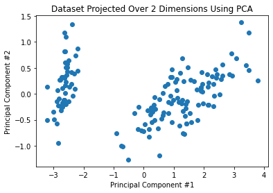
Ah, we can already guess the setosa class to be that discernible cloud on the left of both dimensionality-reduced scatters.
K-means Clustering
Next, we could try and identify the underlying classes or Iris genera and comparing our results against the actual labels. Essentially, we are checking how does the reduction of the feature space using PCA impact our ability to detect the different iris genera using K-means clustering.
from sklearn.cluster import KMeans


N_IRIS_CLASSES = 3

iris_kmeans = KMeans(n_clusters=N_IRIS_CLASSES, random_state=0)
Warning
Note that this is an educational example meant to improve our understanding of dimensionality reduction and clustering, not to represent a relevant use case for clustering. In most cases, clustering is an appealing choice when we don’t actually know the labels (which is why it is considered an unsupervised learning method).
iris_labels_4 = iris_kmeans.fit_predict(X_iris)
iris_labels_3 = iris_kmeans.fit_predict(X_iris_reduced[:, :3])
iris_labels_2 = iris_kmeans.fit_predict(X_iris_reduced[:, :2])
iris_labels_1 = iris_kmeans.fit_predict(X_iris_reduced[:, :1].reshape(-1, 1))
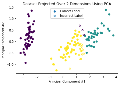
Again, we’ll plot the observations in their reduced spaces, only this time we will include the cluster index (represented with the color of each observation), as well as the classification’s success relative to the true labels (represented with circles for correct versus “X” for incorrect classifications).
plot_reduced(X_iris_reduced, iris_labels_3, y_iris_labels)
plot_reduced(X_iris_reduced[:, :2], iris_labels_2, y_iris_labels)
plt.show()
Clustering Evaluation
How do you think we did relative to the baseline (clustering using all 4 features) as we reduced the dimensionality of the dataset?
plots/accuracy.py
import matplotlib.pyplot as plt
import numpy as np

from itertools import permutations
from plots.utils import organize_kwargs
from sklearn.metrics import accuracy_score
from typing import Iterable, Tuple

DEFAULT_FIGURE_KWARGS = {"figsize": (10, 5)}
DEFAULT_AXES_KWARGS = {"marker": "o"}
DEFAULT_CUSTOMIZATIONS = {
    "title": "Accuracy by Number of Principal Components",
    "xlabel": "Number of Principal Components",
    "ylabel": "Accuracy Score",
}


def plot_accuracy_by_pc(
    classification_labels: Iterable,
    true_labels: np.ndarray,
    fig_kwargs: dict = None,
    ax_kwargs: dict = None,
    customizations: dict = None,
) -> Tuple[plt.Figure, plt.Axes]:
    """
    Plot accuracy scores by number of principal components.

    Parameters
    ----------
    classification_labels : Iterable
        Classification labels estimated by clustering each subset of principal
        components
    true_labels : np.ndarray
        True classification classes
    fig_kwargs : dict, optional
        Keyword arguments passed to the created figure, by default None
    ax_kwargs : dict, optional
        Keyword arguments passed to the created axis, by default None

    Returns
    -------
    Tuple[plt.Figure, plt.Axes]
        Created figure and axis
    """
    fig_kwargs = organize_kwargs(fig_kwargs, DEFAULT_FIGURE_KWARGS)
    ax_kwargs = organize_kwargs(ax_kwargs, DEFAULT_AXES_KWARGS)
    customizations = organize_kwargs(customizations, DEFAULT_CUSTOMIZATIONS)
    distinct_labels = sorted(set(true_labels))
    scores = []
    for labels_array in classification_labels:
        permuted_scores = []
        for permutation in permutations(distinct_labels):
            permuted_true_labels = true_labels.copy()
            for i in range(len(permutation)):
                permuted_true_labels[true_labels == i] = permutation[i]
            permuted_scores.append(
                accuracy_score(labels_array, permuted_true_labels)
            )
        scores.append(np.max(permuted_scores))
    fig, ax = plt.subplots(**fig_kwargs)
    x_range = range(1, len(scores) + 1)
    ax.plot(x_range, scores, **ax_kwargs)
    ax.set(xticks=x_range, xticklabels=x_range, **customizations)
    return fig, ax
from plots.accuracy import plot_accuracy_by_pc


classification_labels = (iris_labels_1, iris_labels_2, iris_labels_3,
                         iris_labels_4)
_ = plot_accuracy_by_pc(classification_labels, y_iris_labels)
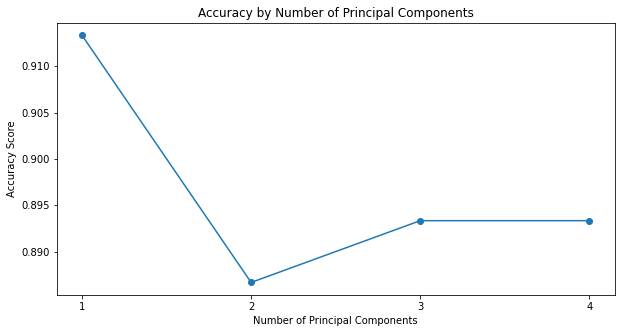
Surprisingly, reducing the dimensionality of the iris dataset to 1 has improved the performance of K-means classification significantly when compared to the true labels.
sklearn’s metrics module also provides us with the silhouette_score metric for evaluating the degree of separation between the clusters:
plots/silhouette.py
"""
Functions to plot silhouette scores by either number of principal components
used to reduce the dataset's dimensionality or number of clusters used by
`KMeans`.
"""

import matplotlib.pyplot as plt
import numpy as np

from plots.utils import organize_kwargs
from sklearn.cluster import KMeans
from sklearn.metrics import silhouette_score
from typing import Iterable, Tuple


#
# Silhouette scores by number of principal components
#

DEFAULT_FIGURE_KWARGS = {"figsize": (10, 5)}
DEFAULT_AXES_KWARGS = {"marker": "o"}
DEFAULT_CUSTOMIZATIONS = {
    "title": "Silhouette Score by Number of Principal Components",
    "xlabel": "Number of Principal Components",
    "ylabel": "Silhouette Score",
}


def plot_silhouette_scores_by_pc(
    X_reduced: np.ndarray,
    classification_labels: Iterable[np.ndarray],
    fig_kwargs: dict = None,
    ax_kwargs: dict = None,
    customizations: dict = None,
) -> Tuple[plt.Figure, plt.Axes]:
    """
    Plots silhouette score by number of included principal components.

    Parameters
    ----------
    X_reduced : np.ndarray
        Dimensionality-reduced dataset
    classification_labels : Iterable[np.ndarray]
        Classification results by number of principal components
    fig_kwargs : dict, optional
        Keyword arguments passed to the created figure, by default None
    ax_kwargs : dict, optional
        Keyword arguments passed to the created axis, by default None
    customizations : dict, optional
        Keyword arguments passed to the axis' set() method, by default None,
        by default None

    Returns
    -------
    Tuple[plt.Figure, plt.Axes]
        Created figure and axis
    """
    fig_kwargs = organize_kwargs(fig_kwargs, DEFAULT_FIGURE_KWARGS)
    ax_kwargs = organize_kwargs(ax_kwargs, DEFAULT_AXES_KWARGS)
    customizations = organize_kwargs(customizations, DEFAULT_CUSTOMIZATIONS)
    scores = []
    x_range = range(1, len(classification_labels) + 1)
    for i in x_range:
        X_subset = X_reduced[:, :i]
        labels = classification_labels[i - 1]
        score = silhouette_score(X_subset, labels)
        scores.append(score)
    fig, ax = plt.subplots(**fig_kwargs)
    ax.plot(x_range, scores, **ax_kwargs)
    ax.set(xticks=x_range, xticklabels=x_range)
    ax.set(**customizations)
    return fig, ax


#
# Silhouette scores by number of K-means clusters
#

DEFAULT_K_FIGURE_KWARGS = {"figsize": (8, 5)}
DEFAULT_K_CUSTOMIZATION_KWARGS = {
    "title": "Silhouette Score by $k$",
    "xlabel": "$k$",
    "ylabel": "Silhouette Score",
}


def plot_silhouette_scores_by_k(
    X: np.ndarray, max_k: int = 10
) -> Tuple[plt.Figure, plt.Axes]:
    """
    Plot silhouette scores by k.

    Parameters
    ----------
    X : np.ndarray
        The dataset to fit
    max_k : int, optional
        Maximal number of clusters, by default 10

    Returns
    -------
    Tuple[plt.Figure, plt.Axes]
        Created figure and axis
    """
    models = [KMeans(n_clusters=i).fit(X) for i in range(2, max_k + 1)]
    scores = [silhouette_score(X, model.labels_) for model in models]
    fig, ax = plt.subplots(**DEFAULT_K_FIGURE_KWARGS)
    ax.plot(range(2, max_k + 1), scores, marker="o")
    ax.set(**DEFAULT_K_CUSTOMIZATION_KWARGS)
    return fig, ax
from plots.silhouette import plot_silhouette_scores_by_pc


_ = plot_silhouette_scores_by_pc(X_iris_reduced, classification_labels)
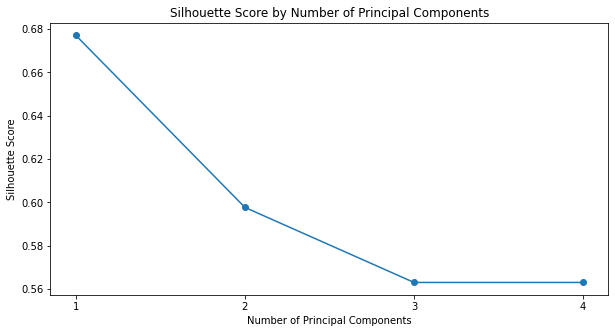
It seems that using only a single principal component yielded not only the best results when compared to the true labels, but also the greatest degree of separation between the clusters (as estimated using silhouette_score).
ASD Subtypes Classification
So, now we know how to implement both PCA and K-means clustering using sklearn. Next, we will try and explore the possibility of identifying ASD subtypes using and on the ABIDE II dataset, again, based on Prof. Tal Yarkoni’s workshop in the NeuroHackademy 2020 (available here). This procedure is somewhat similar to what we did with the iris dataset (in terms of combining PCA and K-means to identify clusters in a dimensionality-reduced space), however, this time the labels are not known to us, and we will try to evaluate whether the results of our analysis produce convincing results.
First, as always, we have to load the data and clean it up a little bit:
TSV_URL = "https://raw.githubusercontent.com/neurohackademy/nh2020-curriculum/master/tu-machine-learning-yarkoni/data/abide2.tsv"
data = pd.read_csv(TSV_URL, delimiter="\t")

# Clean up
IGNORED_COLUMNS = ["age_resid", "sex"]
REPLACE_DICT = {"group": {1: "ASD", 2: "Control"}}
data.drop(columns=IGNORED_COLUMNS, inplace=True)
data.replace(REPLACE_DICT, inplace=True)
This time, however, we’re only interested in ASD positive observations:
asd_positive = data["group"] == "ASD"

# Feature matrix
X = data[asd_positive].filter(regex="^fs").copy()
X
| fsArea_L_V1_ROI | fsArea_L_MST_ROI | fsArea_L_V6_ROI | fsArea_L_V2_ROI | fsArea_L_V3_ROI | fsArea_L_V4_ROI | fsArea_L_V8_ROI | fsArea_L_4_ROI | fsArea_L_3b_ROI | fsArea_L_FEF_ROI | ... | fsCT_R_p47r_ROI | fsCT_R_TGv_ROI | fsCT_R_MBelt_ROI | fsCT_R_LBelt_ROI | fsCT_R_A4_ROI | fsCT_R_STSva_ROI | fsCT_R_TE1m_ROI | fsCT_R_PI_ROI | fsCT_R_a32pr_ROI | fsCT_R_p24_ROI | |
|---|---|---|---|---|---|---|---|---|---|---|---|---|---|---|---|---|---|---|---|---|---|
| 0 | 2750.0 | 306.0 | 354.0 | 2123.0 | 1451.0 | 1128.0 | 269.0 | 1751.0 | 1338.0 | 632.0 | ... | 3.362 | 2.827 | 2.777 | 2.526 | 3.202 | 3.024 | 3.354 | 2.629 | 2.699 | 3.179 |
| 1 | 2836.0 | 186.0 | 354.0 | 2261.0 | 1584.0 | 1241.0 | 259.0 | 1521.0 | 1105.0 | 302.0 | ... | 2.809 | 3.539 | 2.944 | 2.769 | 3.530 | 3.079 | 3.282 | 2.670 | 2.746 | 3.324 |
| 3 | 3382.0 | 266.0 | 422.0 | 2686.0 | 1893.0 | 1359.0 | 234.0 | 1889.0 | 1545.0 | 407.0 | ... | 3.349 | 3.344 | 2.694 | 3.030 | 3.258 | 2.774 | 3.383 | 2.696 | 3.014 | 3.264 |
| 5 | 3020.0 | 390.0 | 408.0 | 2455.0 | 1597.0 | 1219.0 | 280.0 | 2154.0 | 1733.0 | 528.0 | ... | 3.017 | 3.202 | 3.242 | 2.698 | 3.035 | 2.996 | 3.261 | 3.310 | 3.165 | 2.637 |
| 6 | 3522.0 | 140.0 | 471.0 | 2935.0 | 2007.0 | 1483.0 | 195.0 | 1709.0 | 1353.0 | 447.0 | ... | 2.338 | 3.297 | 2.941 | 2.685 | 3.280 | 2.912 | 2.523 | 3.338 | 2.926 | 3.333 |
| ... | ... | ... | ... | ... | ... | ... | ... | ... | ... | ... | ... | ... | ... | ... | ... | ... | ... | ... | ... | ... | ... |
| 992 | 3231.0 | 202.0 | 398.0 | 2699.0 | 1584.0 | 1018.0 | 137.0 | 1992.0 | 1378.0 | 557.0 | ... | 3.329 | 3.192 | 2.415 | 2.698 | 3.230 | 2.815 | 2.756 | 2.872 | 3.107 | 3.069 |
| 995 | 2679.0 | 218.0 | 309.0 | 2041.0 | 1473.0 | 1100.0 | 232.0 | 1731.0 | 1183.0 | 436.0 | ... | 2.561 | 3.458 | 2.758 | 2.756 | 2.945 | 2.560 | 2.651 | 2.703 | 2.248 | 3.410 |
| 996 | 1739.0 | 229.0 | 454.0 | 1600.0 | 1006.0 | 755.0 | 163.0 | 1618.0 | 1279.0 | 361.0 | ... | 2.905 | 3.615 | 2.658 | 2.498 | 3.499 | 3.429 | 3.123 | 2.511 | 3.530 | 3.340 |
| 998 | 3393.0 | 319.0 | 583.0 | 2996.0 | 2057.0 | 1451.0 | 259.0 | 1773.0 | 1455.0 | 662.0 | ... | 2.684 | 3.193 | 2.824 | 2.728 | 3.558 | 2.787 | 3.765 | 2.893 | 2.632 | 3.485 |
| 1003 | 2649.0 | 140.0 | 307.0 | 2359.0 | 1446.0 | 1003.0 | 198.0 | 1807.0 | 1325.0 | 395.0 | ... | 3.287 | 3.170 | 2.494 | 2.725 | 3.477 | 2.850 | 3.695 | 2.637 | 3.263 | 2.981 |
463 rows × 1440 columns
Principal Component Analysis (PCA)
We will use PCA to try and “capture” as much of the variance of our 1,440 features using a limited number of principal components.
from sklearn.decomposition import PCA

N_COMPONENTS = 20

pca = PCA(n_components=N_COMPONENTS)
X_reduced = pca.fit_transform(X)
Let’s try and evaluate how well did PCA manage to find small number of components to explain the variance:
_ = plot_explained_variance_ratio(pca)
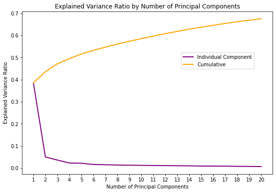
It seems like the added value of using more than 2 or 3 components is relatively negligible, with 3 components explaining a total of 49.43% of the total variance.
K-Means Clustering
Clustering Evaluation
from plots.silhouette import plot_silhouette_scores_by_k


X_3 = X_reduced[:, :3]
_ = plot_silhouette_scores_by_k(X_3, max_k=10)
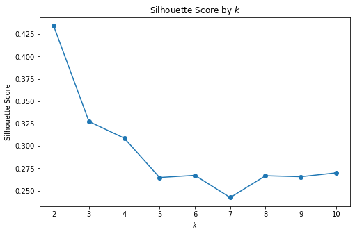
The best degree of separation was obtained for \(k=2\). Let’s visualize the two clusters and obtain some qualitative understanding of how well (or badly) our model did:
classification_labels = KMeans(n_clusters=2, random_state=0).fit(X_3).labels_
plot_reduced(X_3, classification_labels)
Indeed, it seems our model’s ability to cluster ASD subtypes using three principal components is rather poor.

